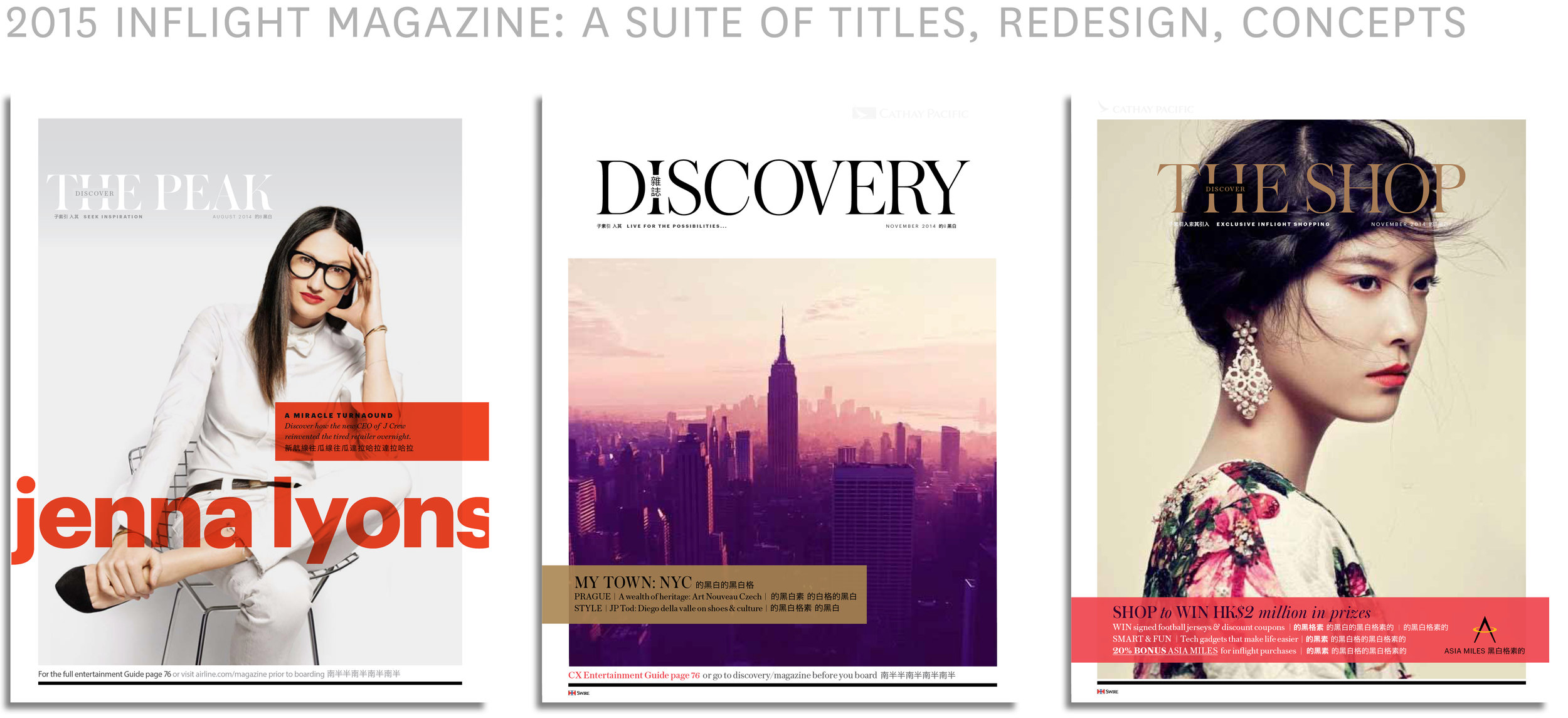
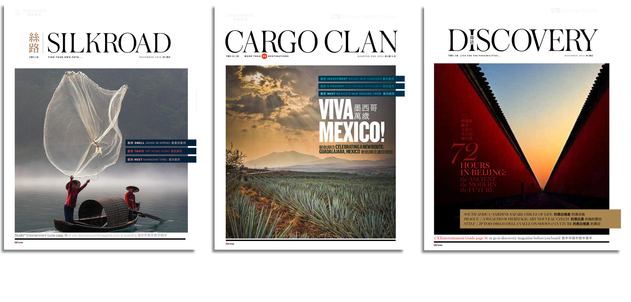
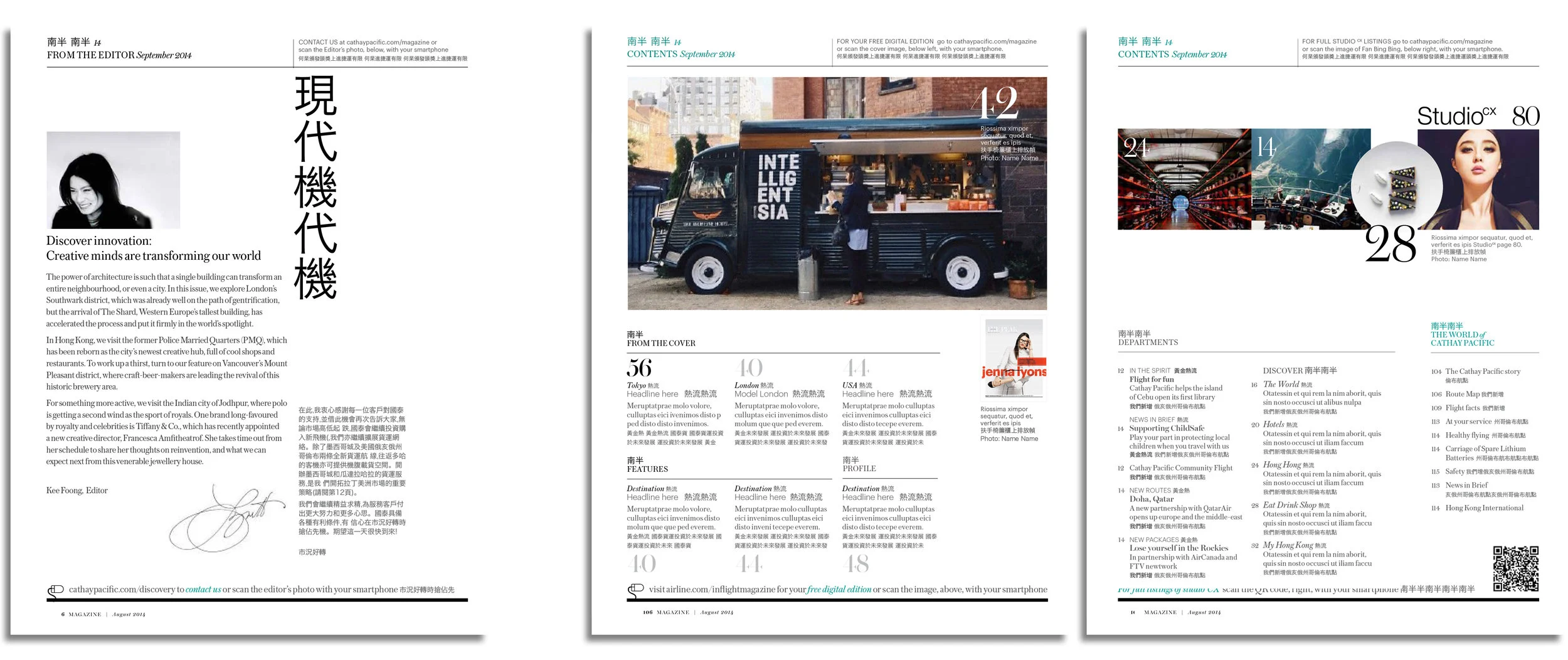
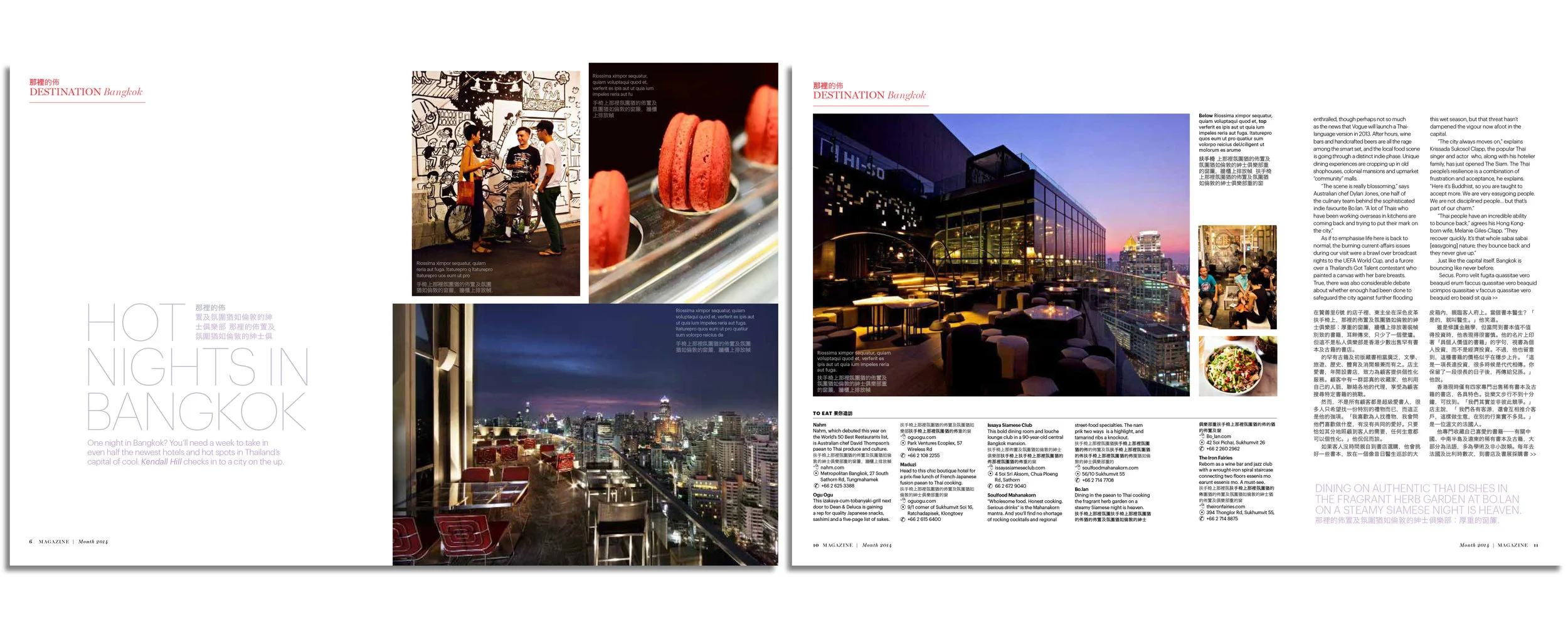
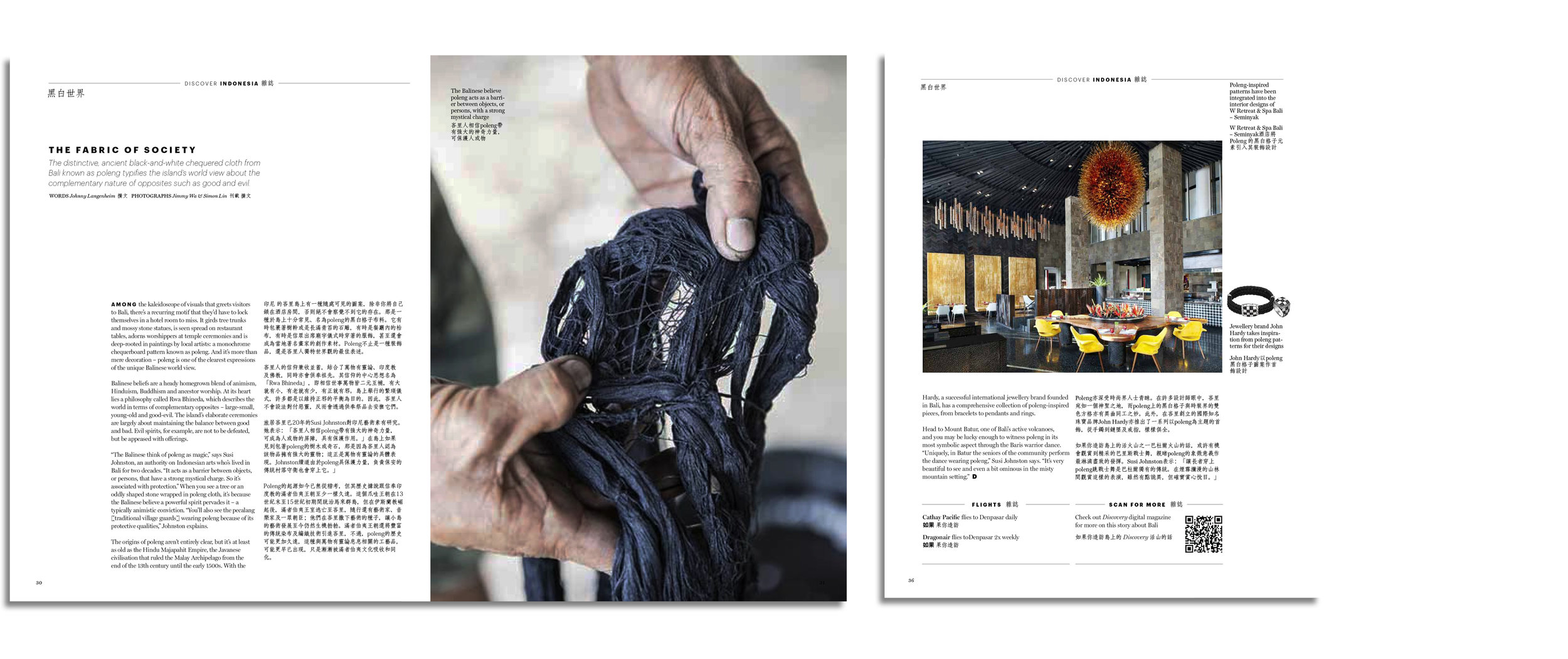
I was asked to redesign a suite of magazines for an asian airline. The hook was it needed to be done remotely, in dual-language, to be included in a major pitch in a few weeks. Knowing the complexities of this huge ask, I called on my familiar team in London, Boston and regional eastern Australia to create an ‘elegant, classic, international design with Asian influences’. We worked day-and-night to develop key pages, and then sent templates and styles for the Asia-based team to use to create dummies of each title. The stack of titles were beautifully wrapped in rice paper for the final presentation.
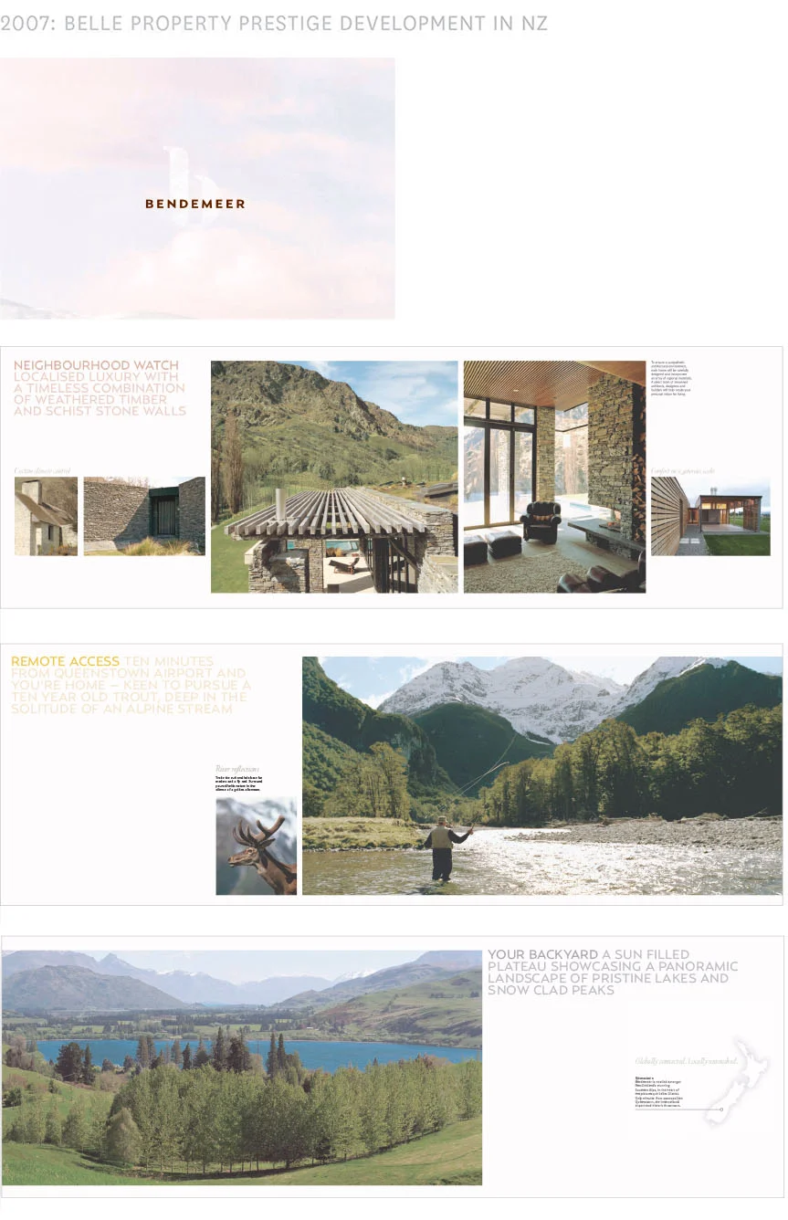
This beautiful brochure for Bendemeer luxury retreats on New Zealand's south island was printed on uncoated stock with a tiny fleck of mica to make it glisten like sushine on snow.
BRAND VALUES News Magazines held a luncheon for their luxury brand clients to reinforce their stake the prestige brands market. Here's a selection from the 600+ screens we created: a mammoth research and design task left largely to us. Starting the presentation with a 'sizzle' it was vivid, striking and ‘to-die-for’ -- the precise brand value their titles project.

Strong content deserves a strong platform. The Chairman of AJLucas was a no-nonsense bloke, and wanted this annual report different from previous years. Rather than being project driven, the content should show their serious commitment to sustainability. He was pleased that the message came through loud and clear. No fluff. Portraits: Andrew Quilty

Finance and business publishing embraces cliché imagery with gusto. Improving the approach to crafting images (as we did for APlus magazine) or at least executing ‘old’ clichés beautifully makes a huge difference. It came down to simple infographics and a list of suitable 'illustrators'.
SCOPE: name, mast, look & feel, flat plan development, image references, style guide
Editor Tony Featherstone asked for advice to improve a weekly e-mailout for the ASX. A few simple tweaks got it into shape: a clear, elegant and easy-to-use hierarchy was established, based on existing elements and content. A gridded template, font and typography specifications were sent recommending a list of illustrators (in place of stock images) and the use of black and white photos for contributors.
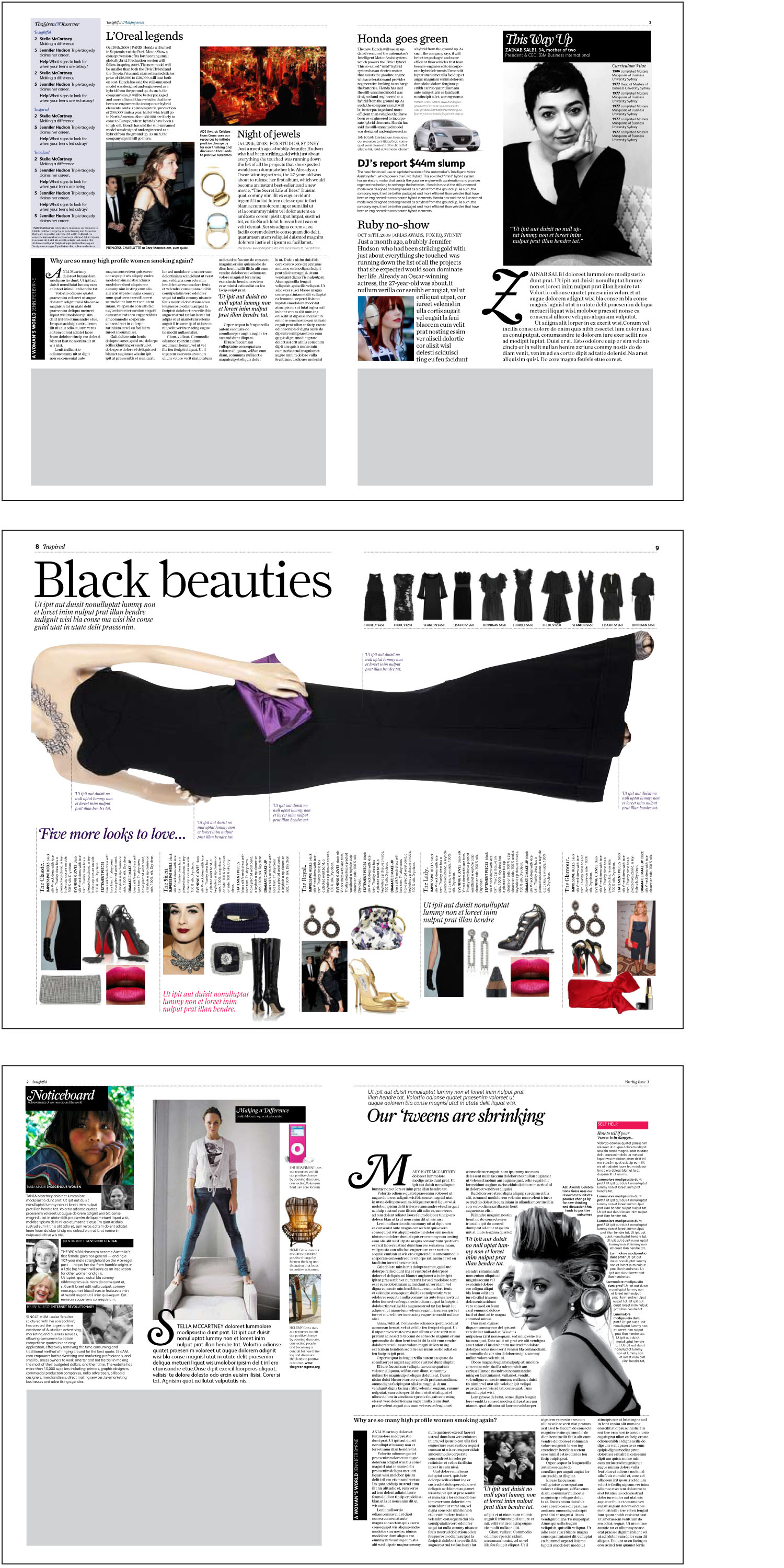
The Harlot & Observer was a few years ahead of its time. In 2008 an editor asked us to design a proposal for weekly eight-page newsprint compact for women, with informative, relevant and largely newsy content. The result was vibrant, digestible, easy to edit on a weekly basis, with a big ticket centre spread in each edition to draw out some great detail and impressive, large scale possibilities.
SCOPE: name, mast, look & feel, content development
The well regarded South China Morning Post had been losing reader appeal through accumulated, reactive spot design. To reassert its authority and relevance to the region, the newspaper’s typography and approach to visualising the news was reworked. New York type designer Christian Schwartz refined an exclusive version of a headline typeface. Consistent styles and reworked navigation, and a range of tools that would allow the subeditors to add infographic material and story-telling variety to their pages had the paper back to its best.

Art directing is about getting the tone right. This proposal dummy was as much about 'what it is not' as 'what it is'. While working with Federal Publishing to consolidate all the urban Courier titles under one style-guide, it became clear that resources within their prestige lifestyle titles were primed to produce a beautiful lift-out for the festive season. "Wrapped must be elegant, accessible and abundant" -- within a tight weekly deadline.
The Hong Kong Standard is a very well-respected, widely read compact financial. To re-invigorate the 'tiger', we redesigned the masthead, and revised styles and templates which improved the overall look-and-feel. The redesign team was based at our studios in Sydney, while a de Luxette worked with the stakeholders over in Hong Kong. The liftout mags were also given an overhaul in line with the classic, modern redesign.
Australia’s Vogue Living is world renowned. To keep VL in the bright light, in a tough marketplace, we worked with the editor and VL team for two months, developing ways of working and creation of content to better connect with readers and to ease deadline pressure.
From 2003, I spent two years commuting to Melbourne for the redesign of The Age, The Sunday Age and the lifestlye magazines. The team there were very receptive to a redesign: partly due to the fact that there was a dedicated art director who worked closely with the editor, Michael Gawenda, on the paper. Another major plus was the presence of an illustrator/image editor, dedicated to cultivating imagery with local photographers, designers and illustrators. Years of 'on-the-fly' design made way for clean styles and new templates, with all components, sections and flat plans coming under the microscope. The Age made the most of our time there, always with their readers at heart, and gave the paper a fresh, new start.
Not-for-profit organisation WorkVentures was a de Luxe client for many years. Above, the 2001 annual report, their first, we used a simple typographic concept, and below, a stunning photographic concept for the 2002 'Focus on New Growth' report.
When I first arrived in 1997, de Luxe had just started a redesign of the SMH Good Weekend magazine. Greg Hywood, publisher, asked us to advise on a redesign for the SMH, including the massive weekend edition. Specifications for the new press at Chullora were for a slightly narrower page size (we suggested a smaller Berliner format!). We had lively boardroom discussions including section editors: Greg saw it as an opportunity to question every component of the paper. It was a massive task, and took two years to complete with a dedicated in-house team at our disposal.
Milton Wordley invited me to join the Southlight studio in 1995 as an intern and assistant at our graduation exhibition opening. Flattered, inspired and overwhelmed, two years later I emerged from the darkrooms in love with the craft and a collection of my own beautiful images. It set me on the road in search of brilliant editorial design with an immense respect for the great photographers of our time.
ABOVE: Belvoir theatre season 1997
Art Directed by Bob Cousins, Belvoir paid homage to Irving Penn's series using a deep canvas corner. Taken on the Cambo, printed and toned on A3 fibre-based paper.
