2017 The Harvard Business Review Redesign
I was excited to be invited to take a fresh look at the HBR last year, to embrace the changing readership and global nature of business in digital times. The magazine was reduced from ten to six editions annually, and a rethink on the content and composition was undertaken. We recommended a new approach to typography and image making this year, too. This was beautifully upheld in the energetic launch edition, and more recently, was reflected in the circulation figures which have increased by 10.2% this year.
Here's is a short clip of some of the conceptual pages that were generated.

And here are a few pages from the beautiful style guide.


2009 – 2015 The Harvard Business Review Redesign 'Where smart lives...'
In 2009 a new editor (ex-Time Magazine’s Adi Ignatius) was brought in to reinvigorate the tired journal to become more relevant to today’s readership. We spent time in Boston with the team, planning, discussing production, and directing the launch edition.
With a complete review of the content and flat plan, the brand promise and the production sequence was agreed before the redesign was commenced. Everyone had opportunity to voice hope and concern in planning for a shift in culture.
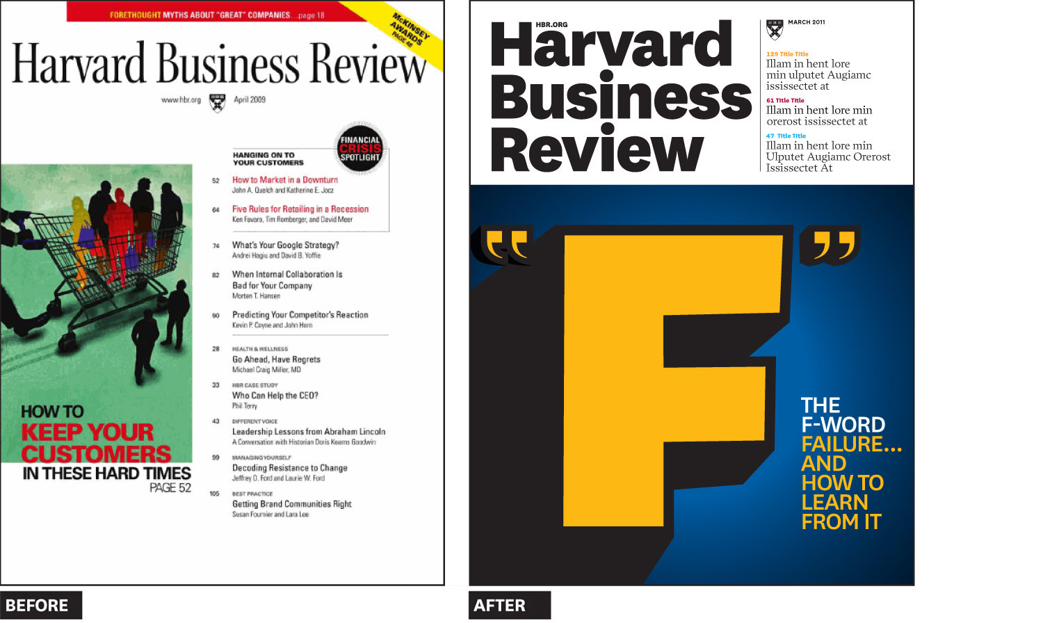
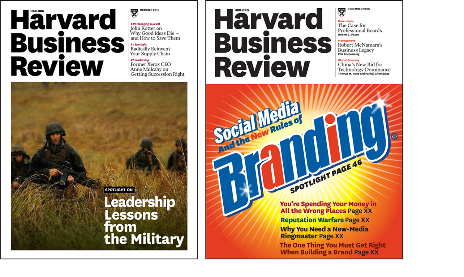
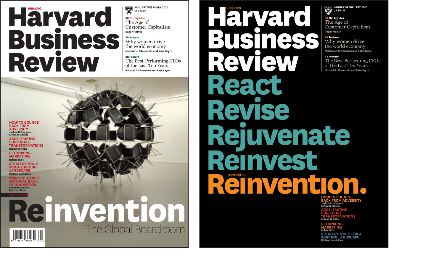
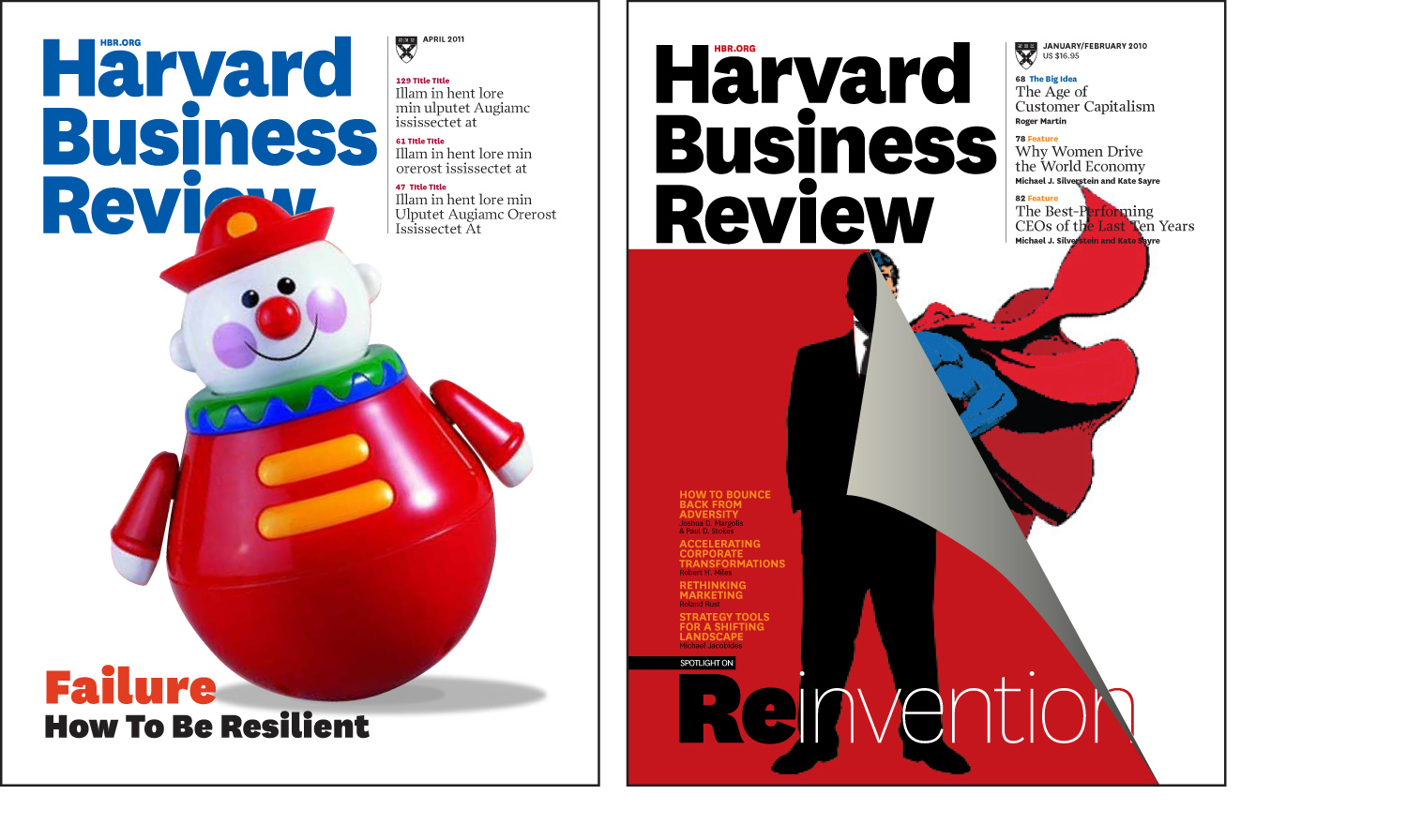
While still very conservative, the Harvard Business Review embraced many of our concepts... though not all! Each edition saw the development of many many cover concepts. We were most surprised when the ‘F’ word cover made it to press for the March 2011 edition.
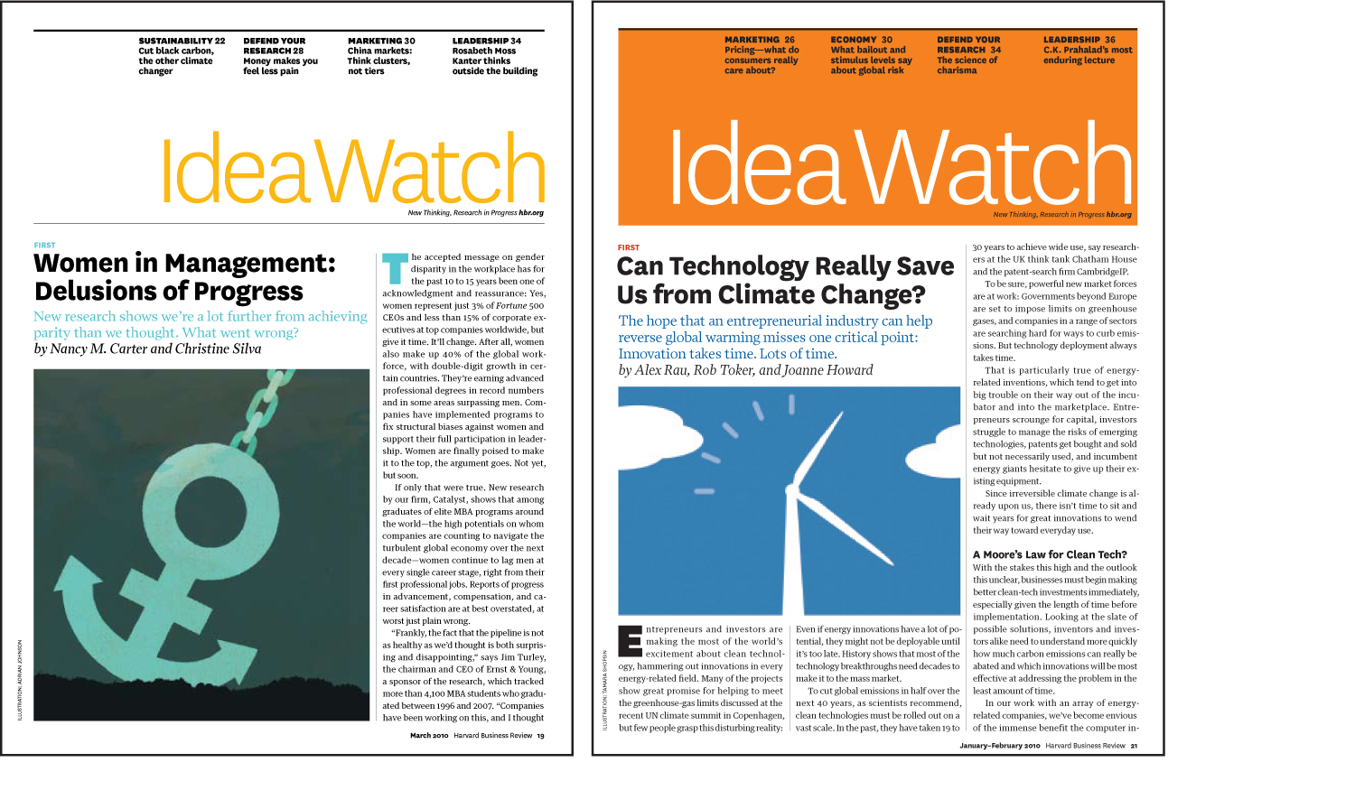
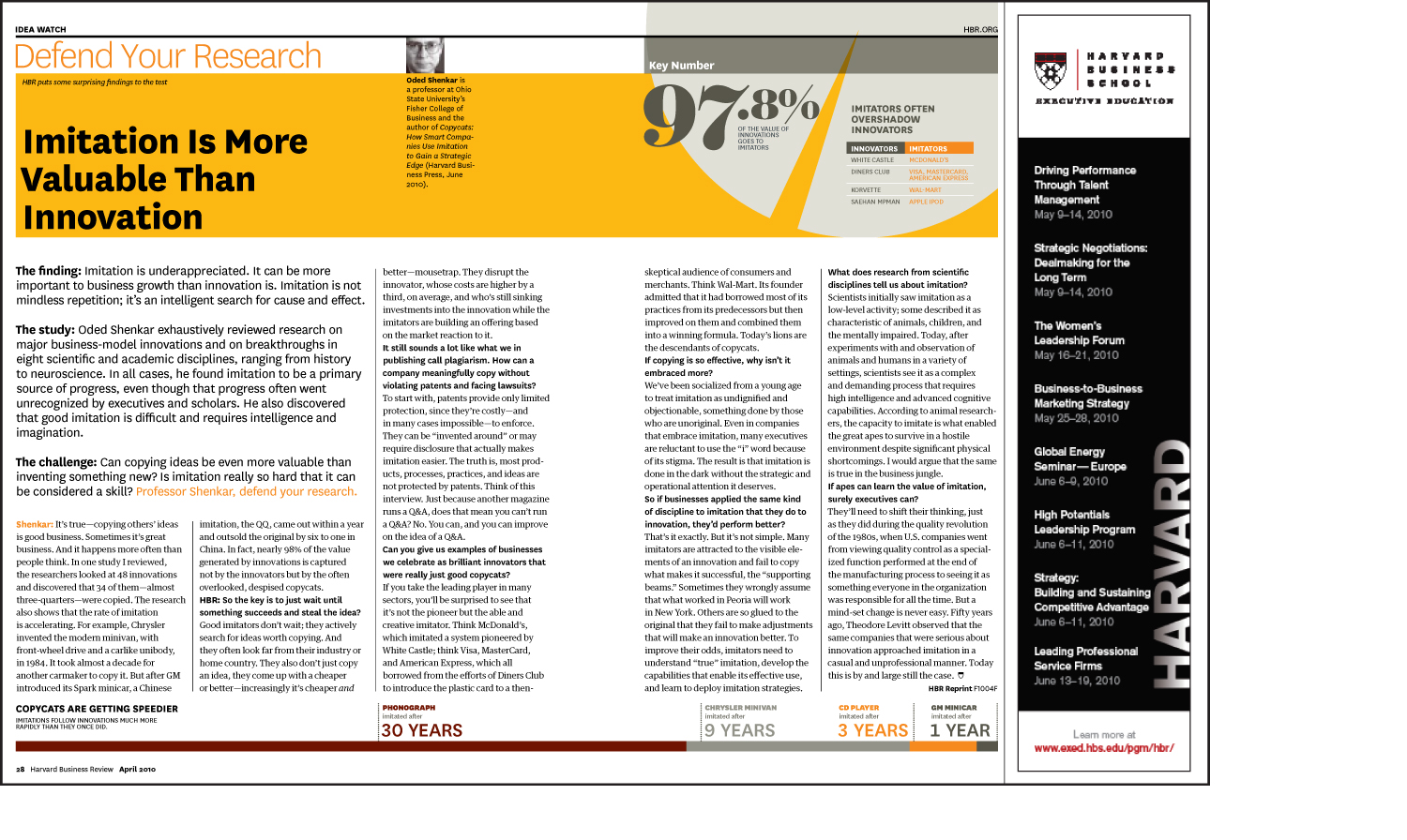
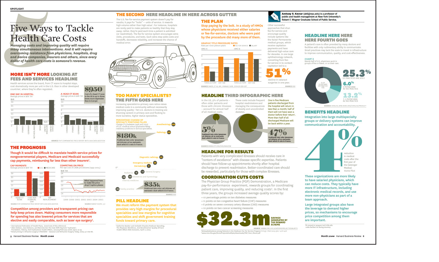
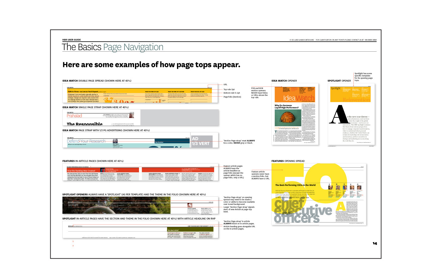
The front of book “IdeaWatch”allows for a newsy start to the edition, with with the ‘shoulder’ panel a space designed to house a captioned infographic or informative nuggets. This 'shoulder' continues right through the magazine.
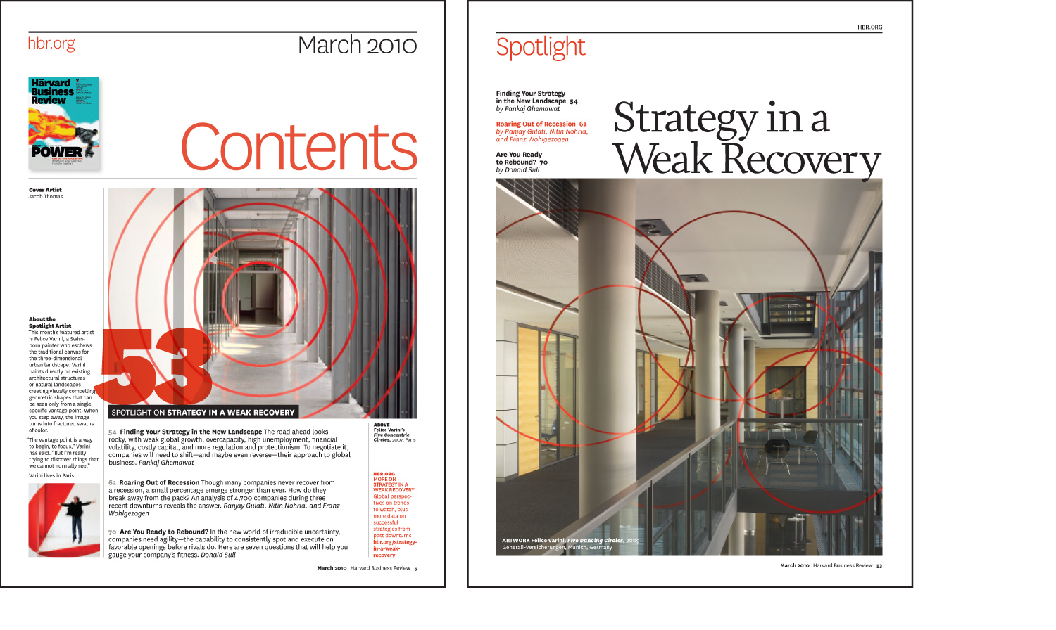
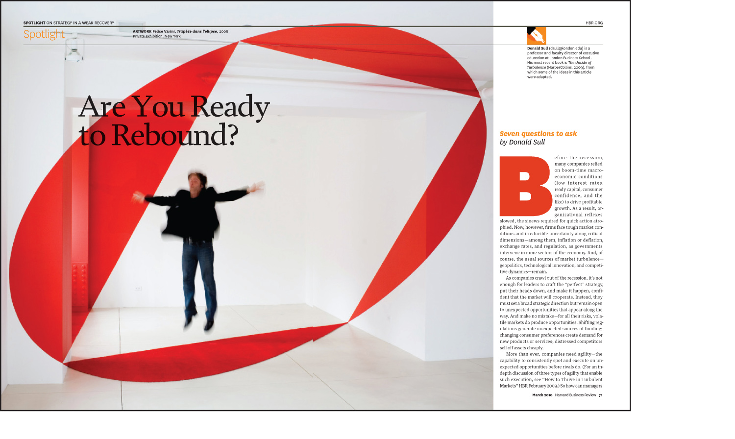
Each edition has a special section within the 'feature well’. Named ‘Spotlight’ it consists of an opener, several long articles, and its point of difference is that each month it uses a series of artwork or installation art as its imagery. Quite striking, and visually connected to the content.
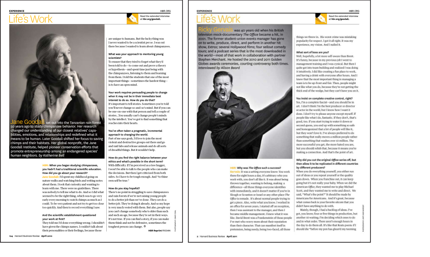
It appears a new look and some new found courage has given them wings in a few other areas of the magazine. The last page of the magazine, “Life’s Work”, has provided a forum for insight into more lateral characters such as Ricky Gervais, as below, and Jane Goodall.
A recent article in the NYTimes “Media Decoder” reports HBR’s news-stand sales are up 19%, website visits are up from 600,000 to 7 million, and they’ve signed big advertisers like Goodman Sachs, British Airways and Cartier. Looks like the redesign is working.
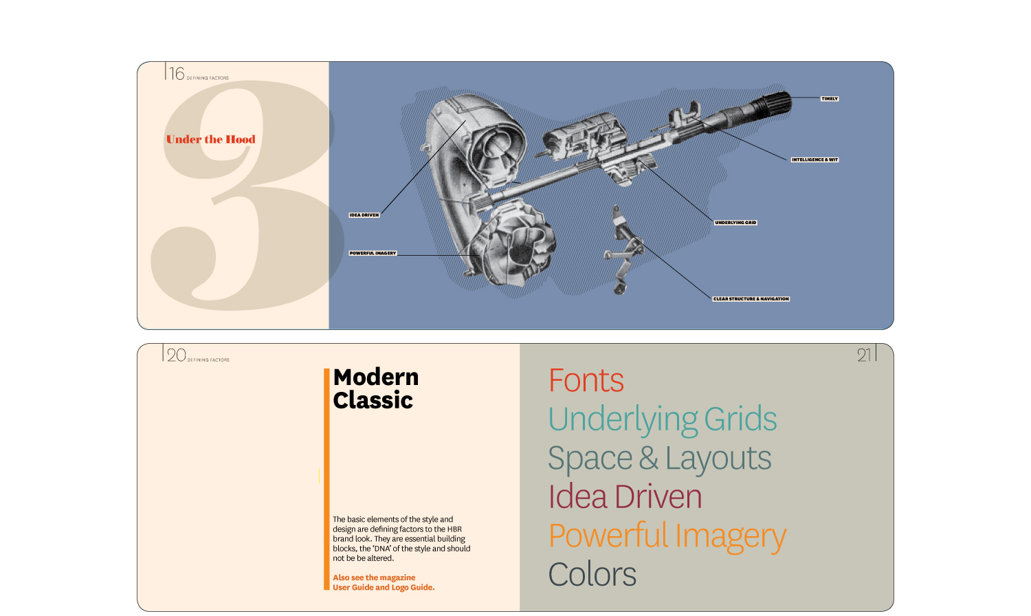
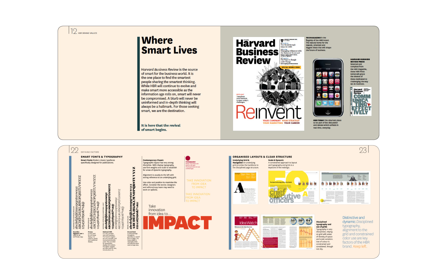
Establishing the brand promise 'Where smart lives...' Agencies and clients receive the HBR brand guide which demonstrates, articulates and displays the brand values inherent to HBR in great detail.
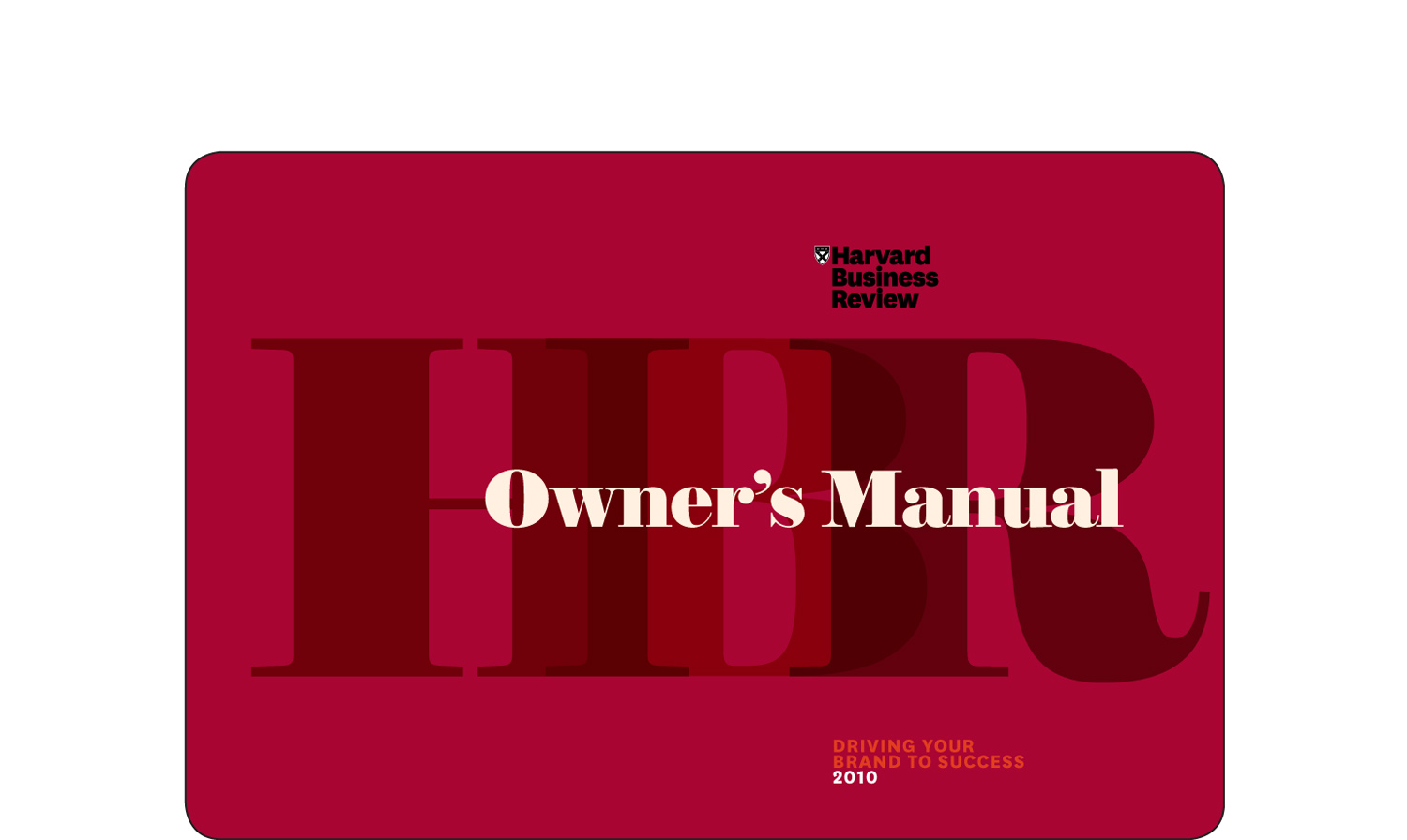
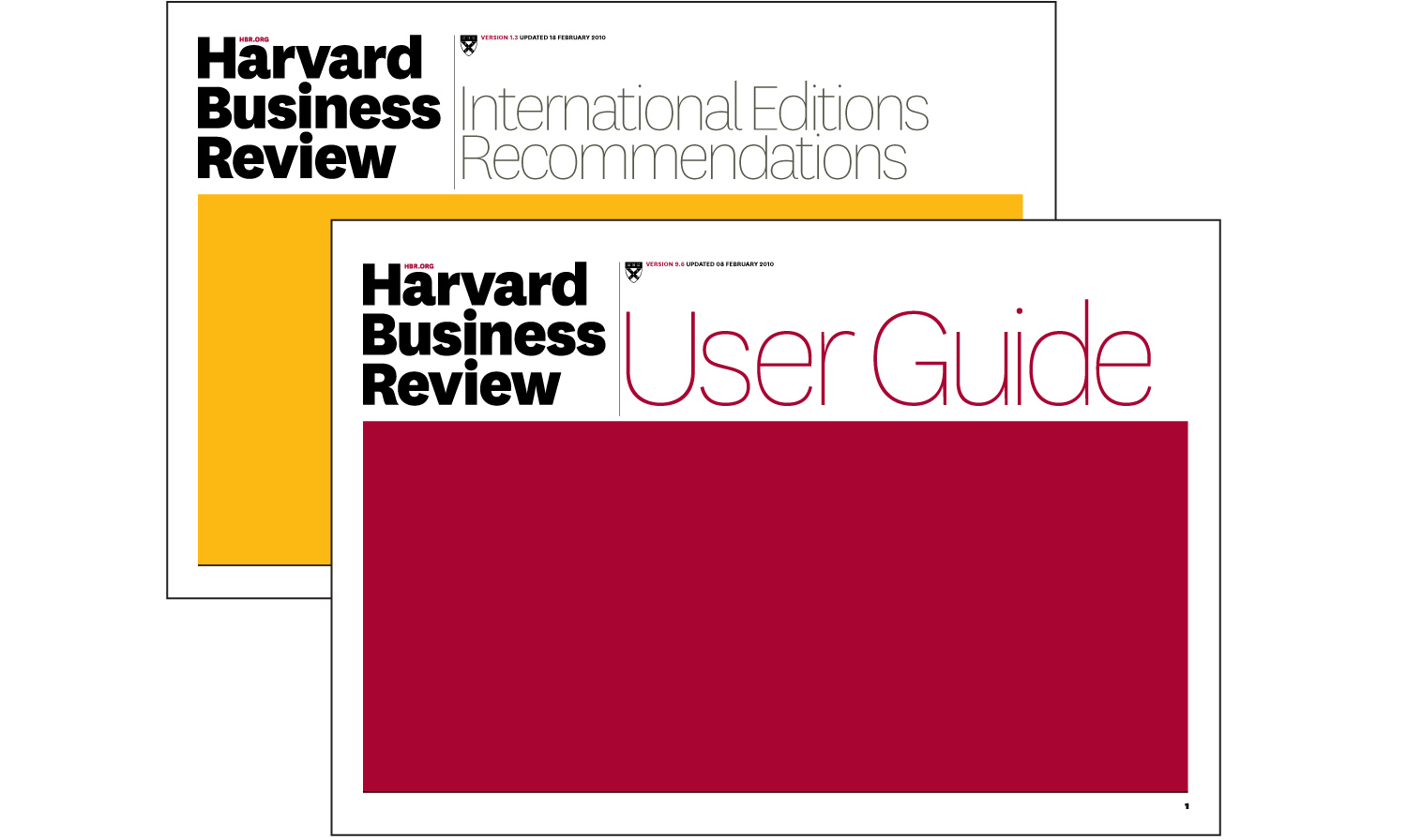
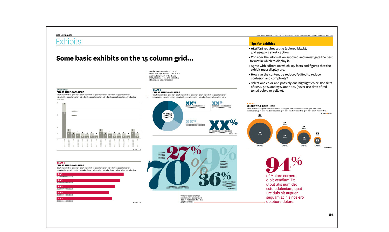
Style guides are produced for every redesign, and stored on the client website for a point of reference
____________
BACK to projects...
____________
___________
SEE MORE REDESIGNS in the gallery...