The Australian Financial Review Redesign 2012–2013
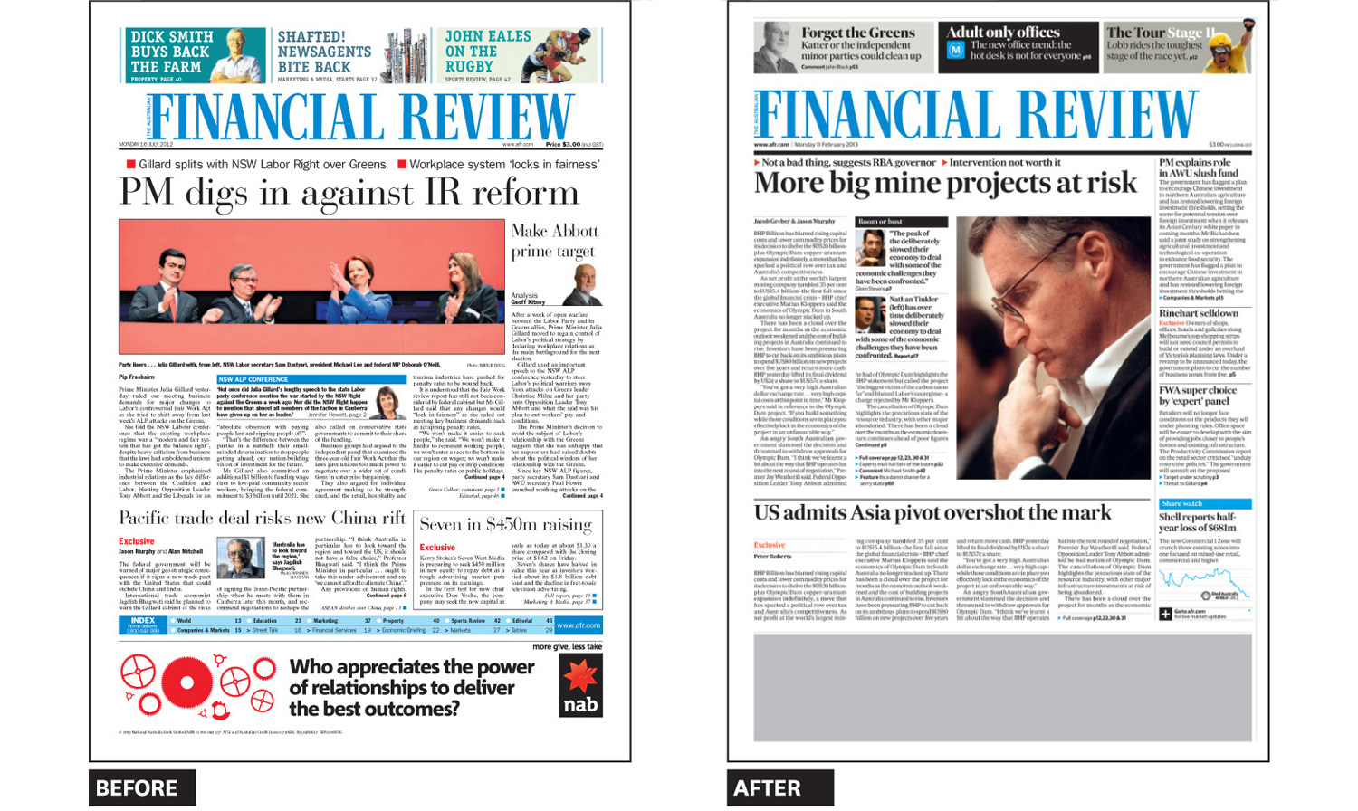
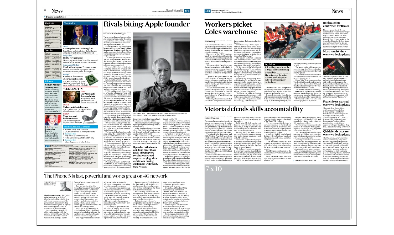
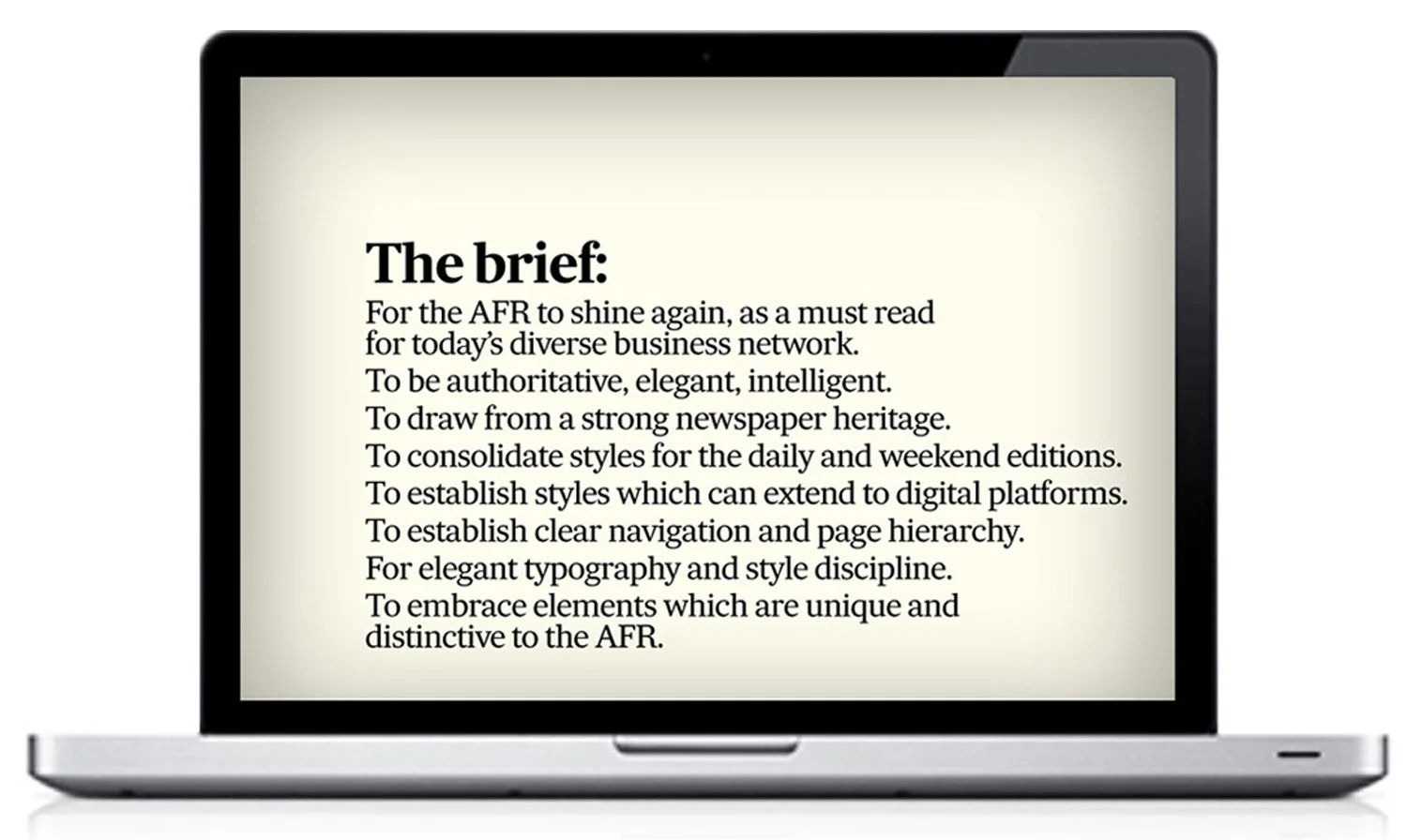
In 2011 Editor-in-Chief Michael Stutchbury asked for some recommendations to ‘tidy up’ the AFR and give it a clean new look. After a few meetings, the brief was finally articulated as ‘a redesign of the AFR must be authoritative, elegant and intelligent, drawing strongly from the heritage of newspapers.’
A carefully planned redesign on a very tight budget commenced in 2012. As head of a small team, who I was sure could pull together the best result within the tight six week deadline, our work began. Over a number of weeks we refined the typography and layout using the existing baseline grid and current content.
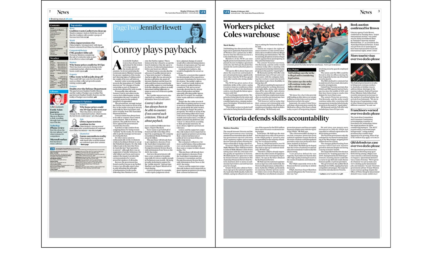
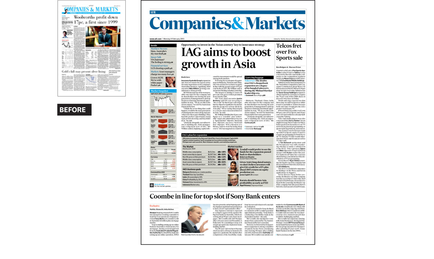
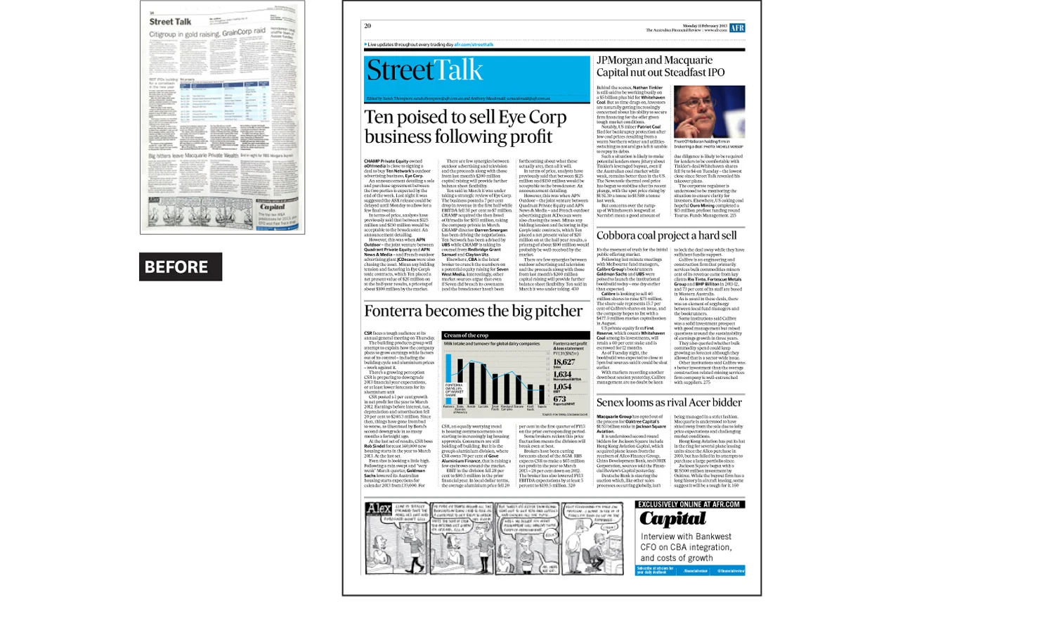
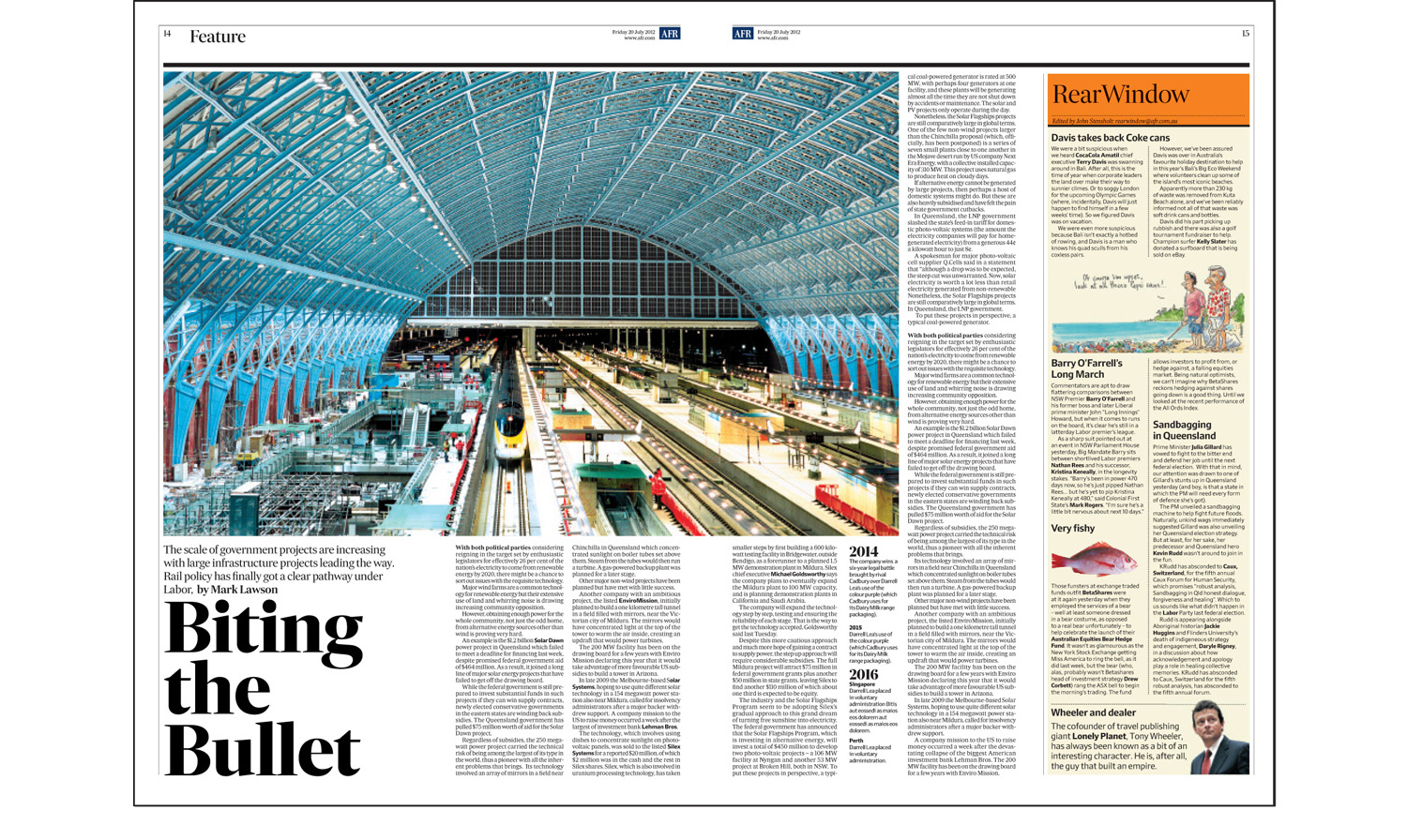
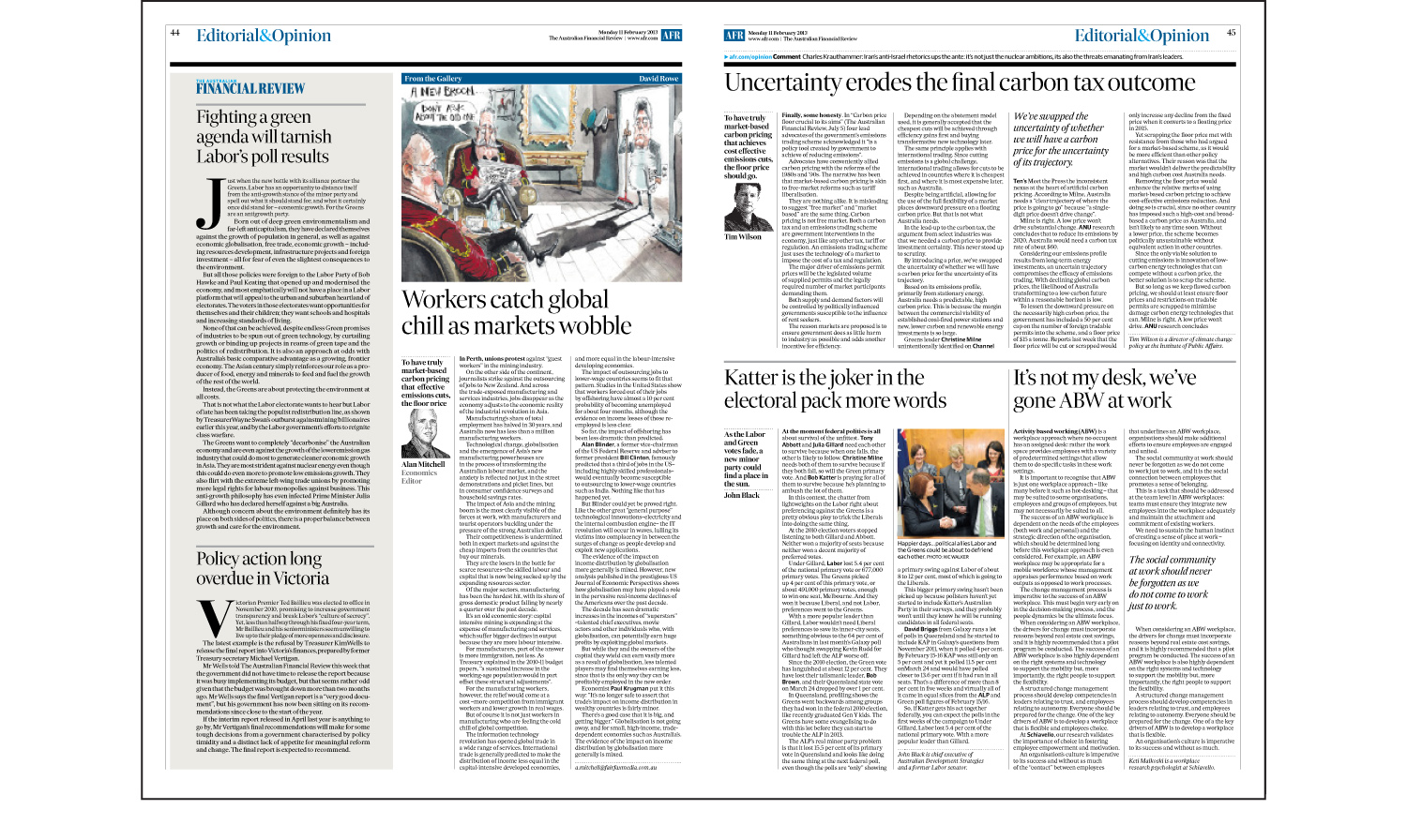
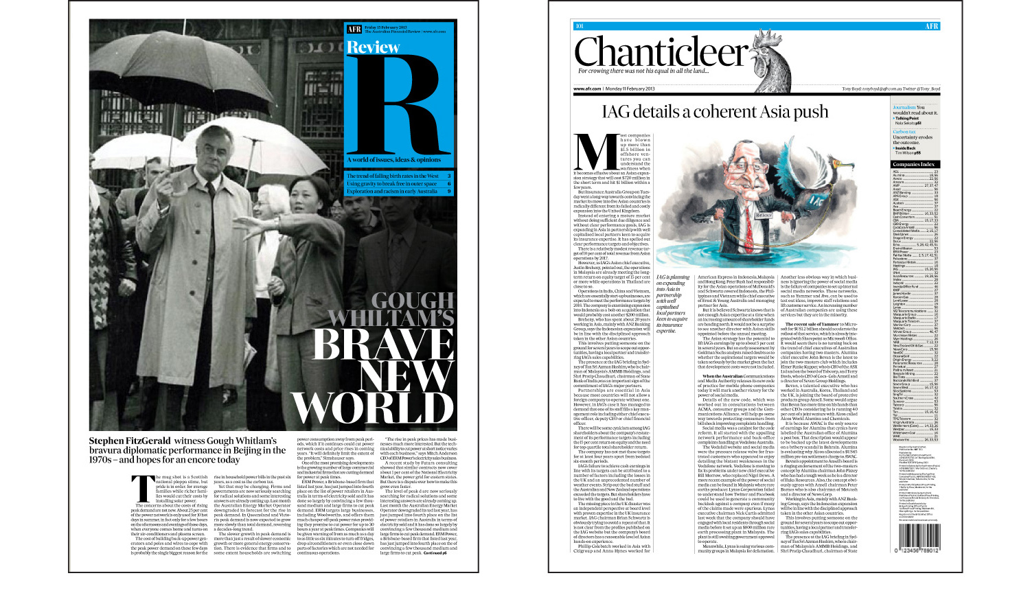
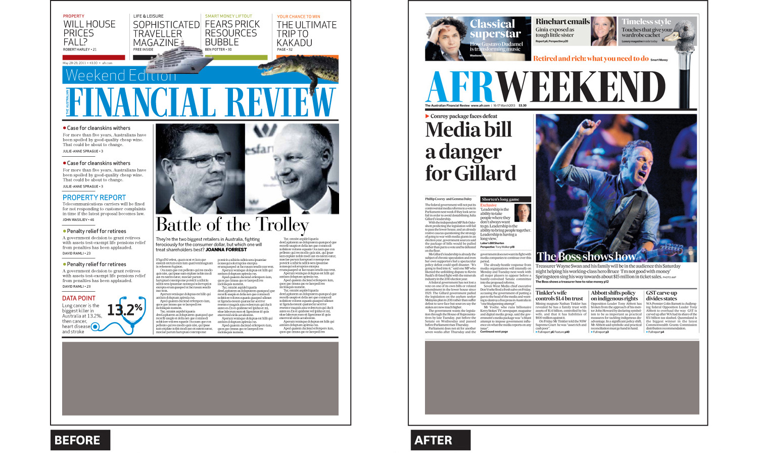
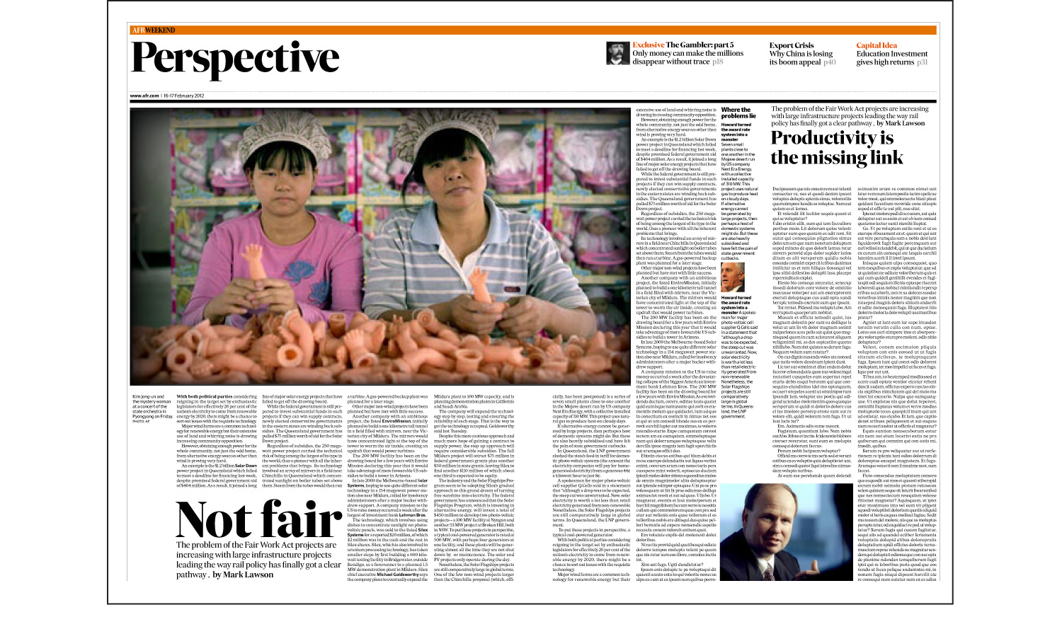
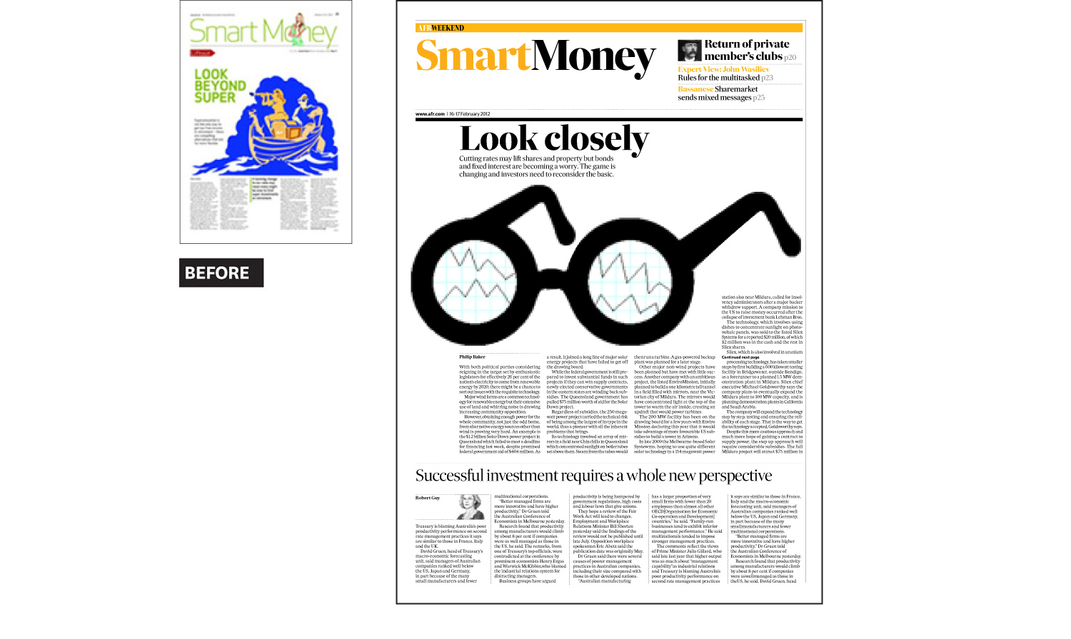
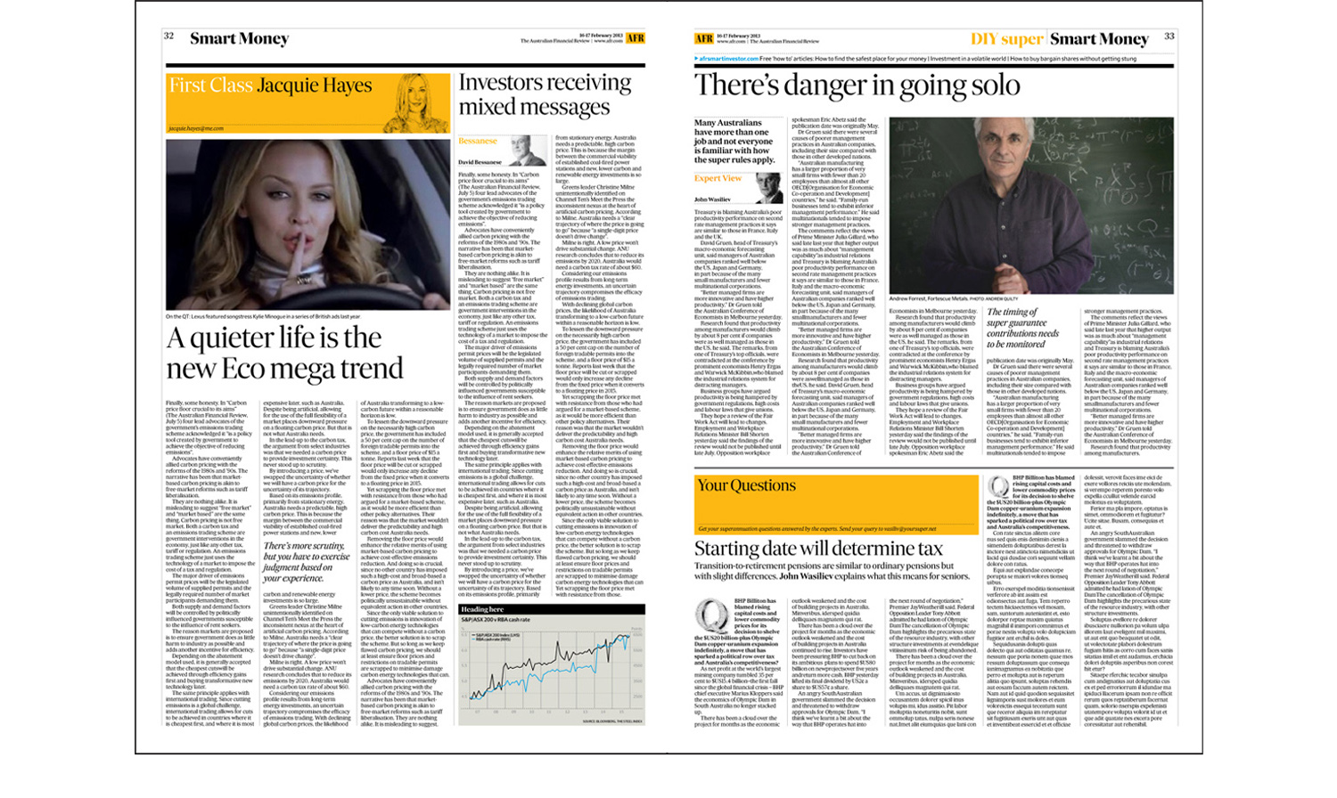
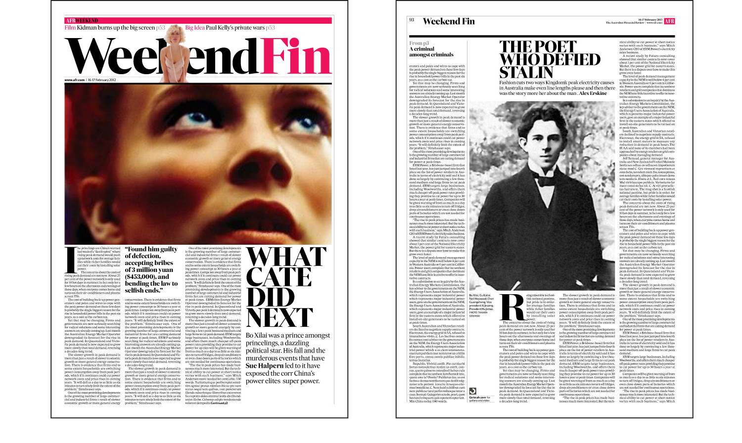
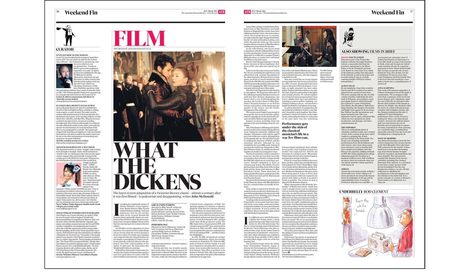
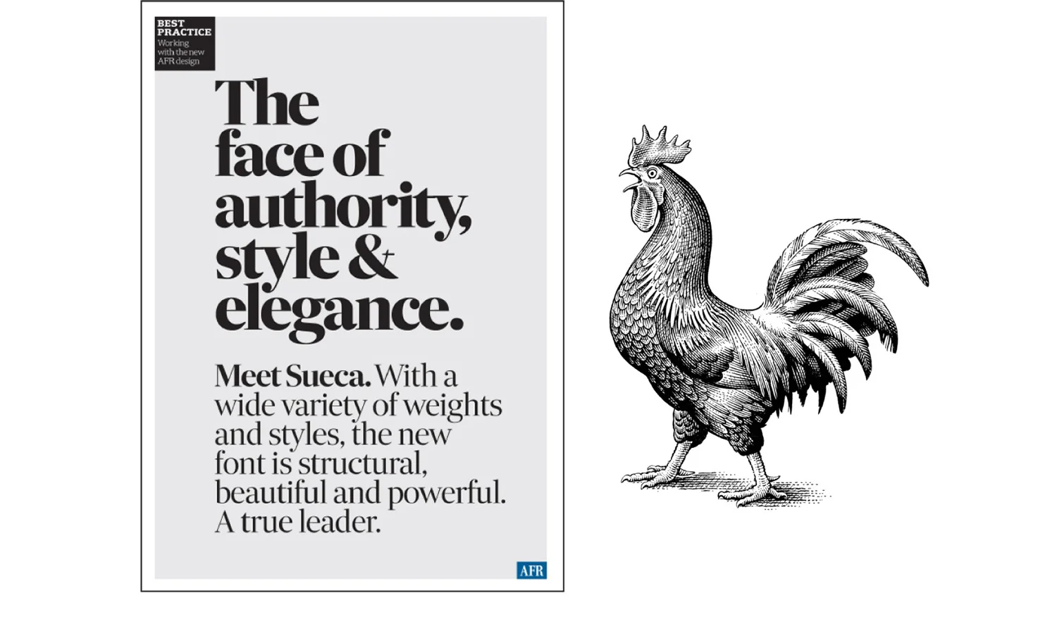
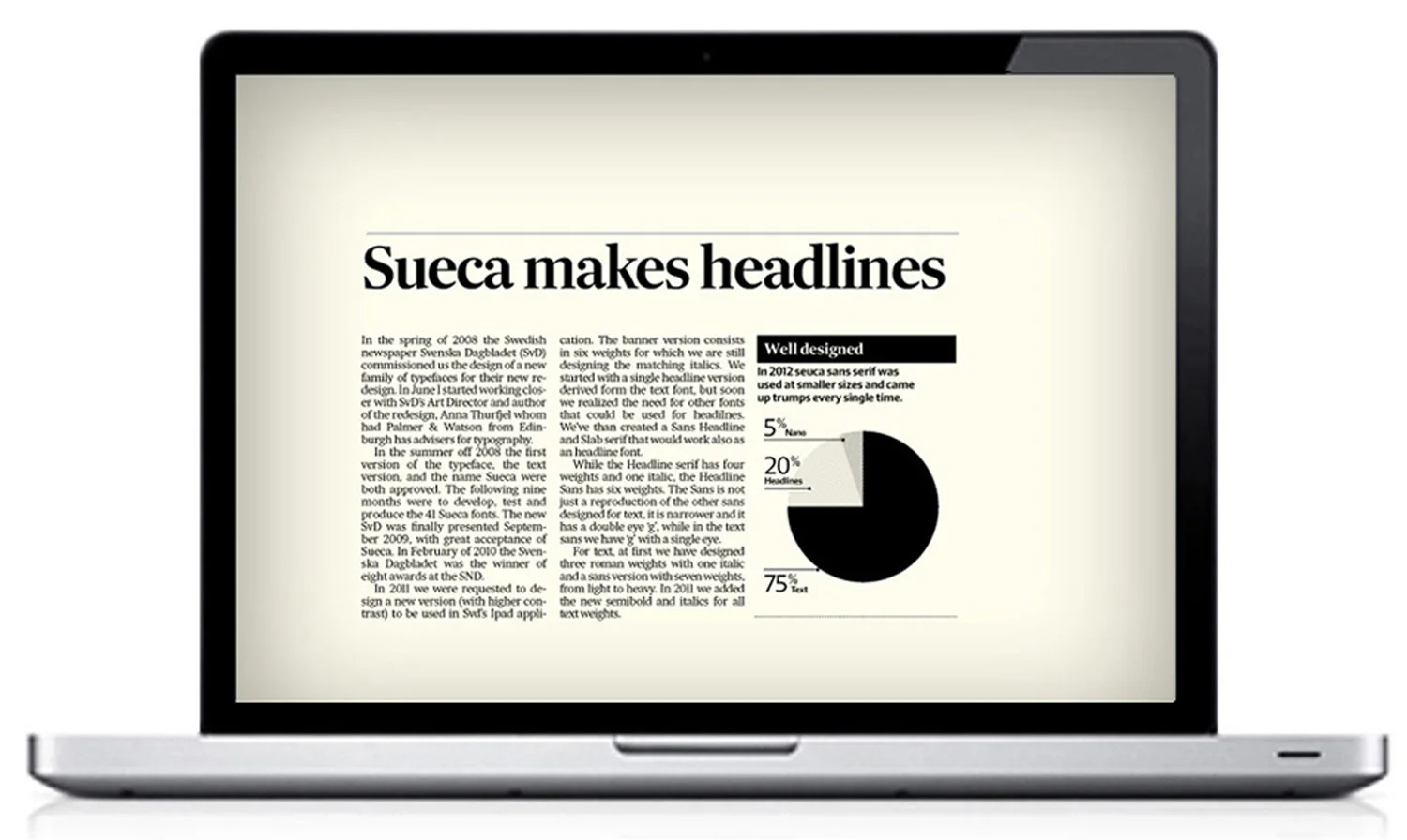
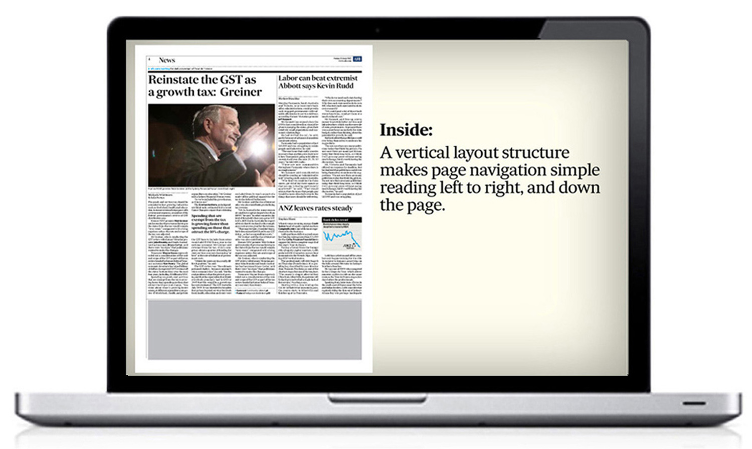
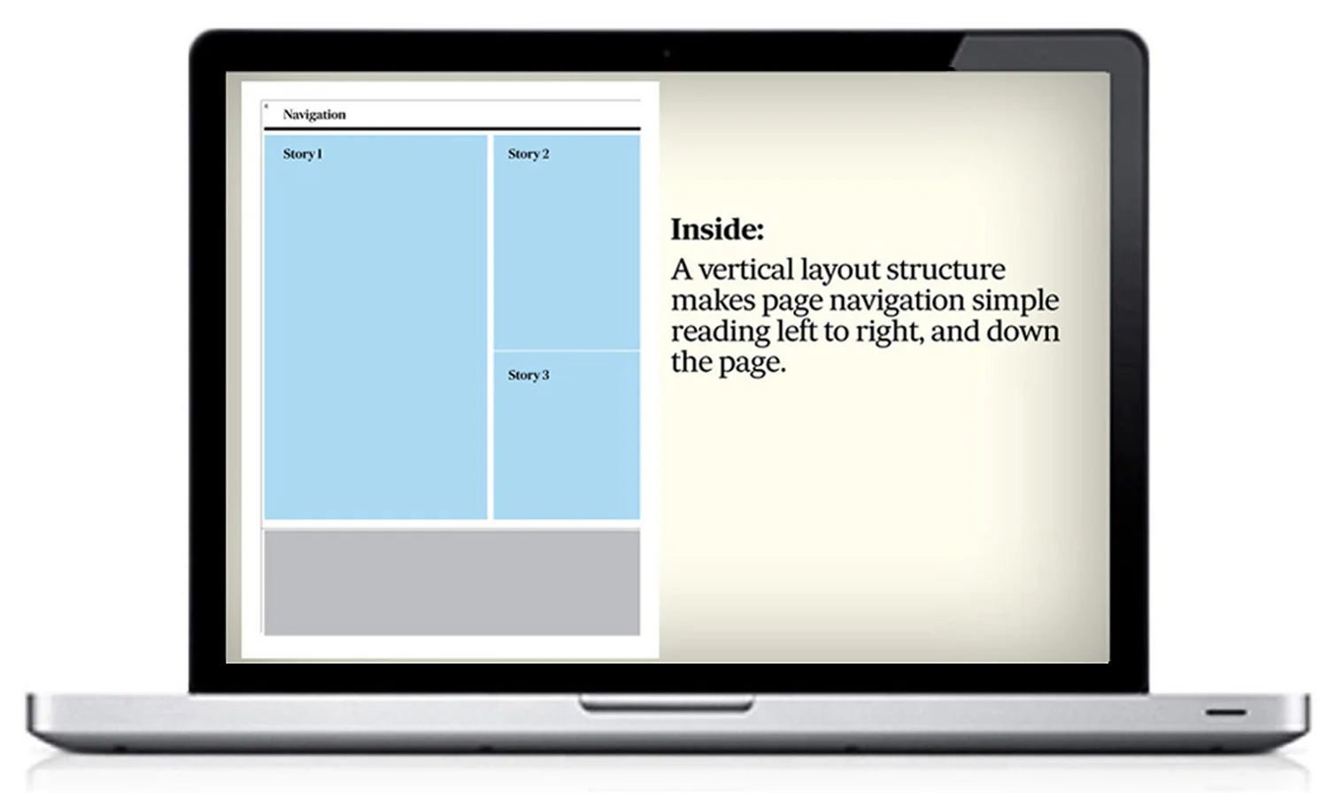
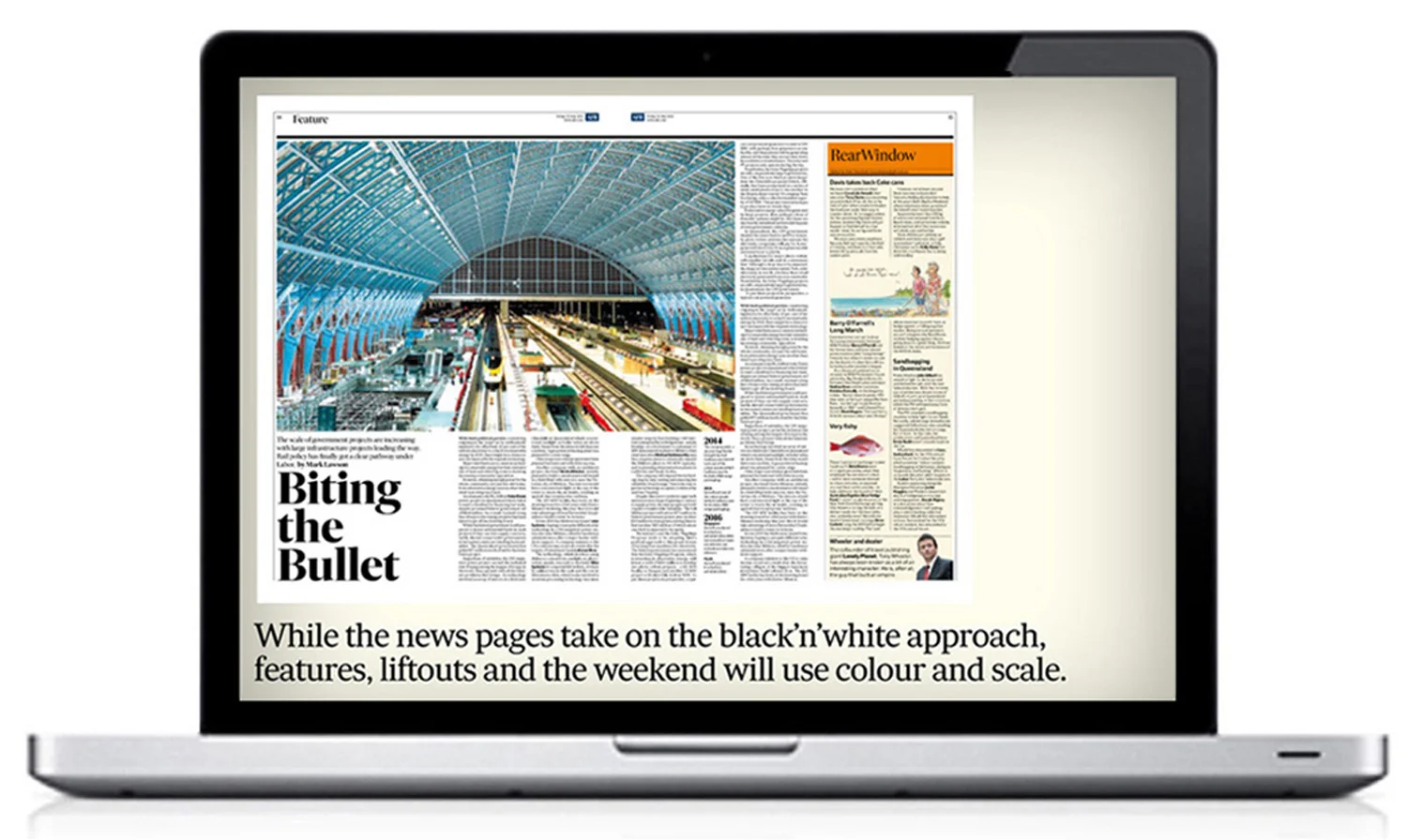
A new font, named Sueca, a refined elegant direction for typography and new page templates took this trusted and respected compact to a new level. 'News' is very disciplined, while the sections allow the art director a little more room for dynamic layouts.
From well crafted page tops, to locating your ‘favourite read', navigation is clear and consistent. From page one, page pointers have crisp cyan arrows, followed by a comprehensive contents on page three. Page tops, including the masthead, were very carefully designed to direct the reader through the paper and to online content, without getting busy or 'loud'. Image selection is now much more discerning, is always under the art director's close scrutiny, and triggers great debate at news conference.
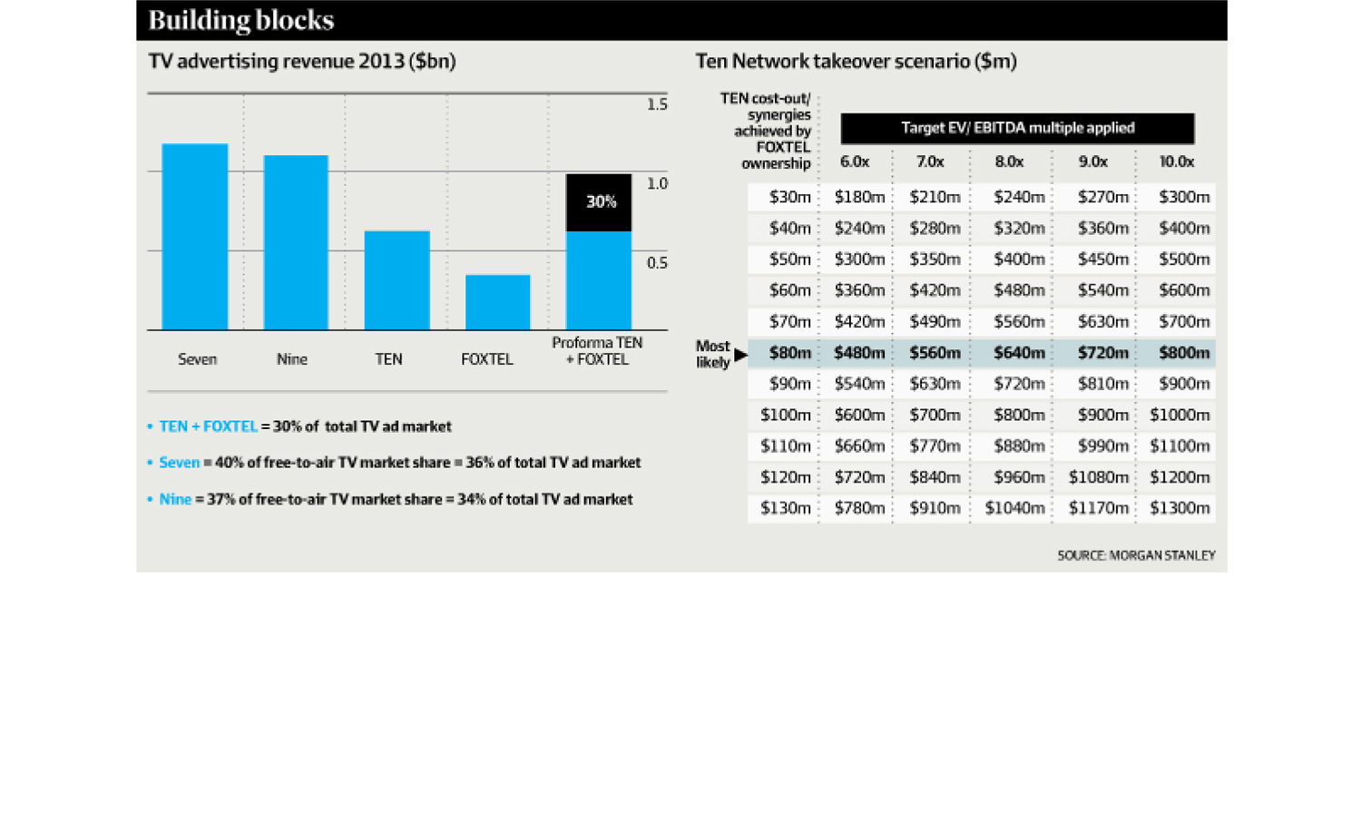
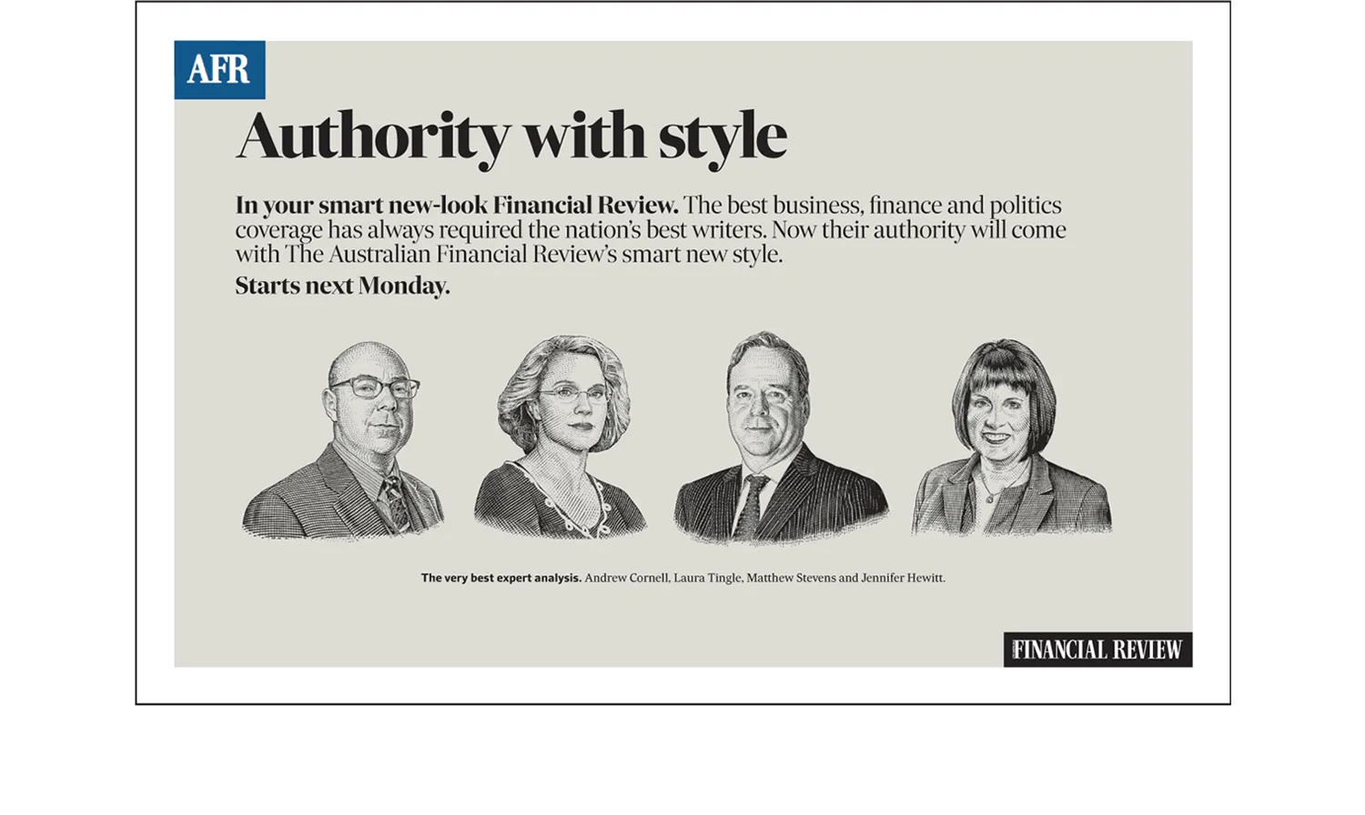
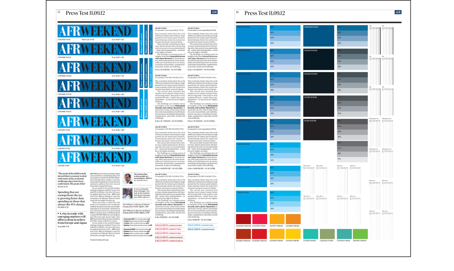
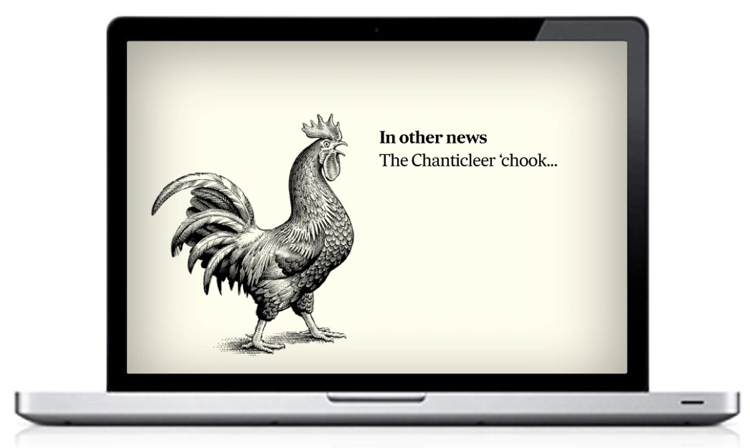
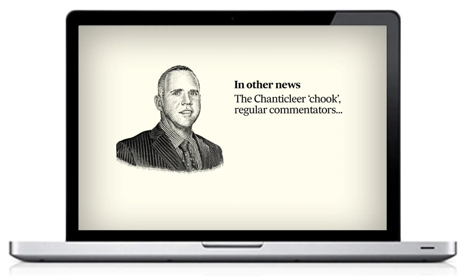
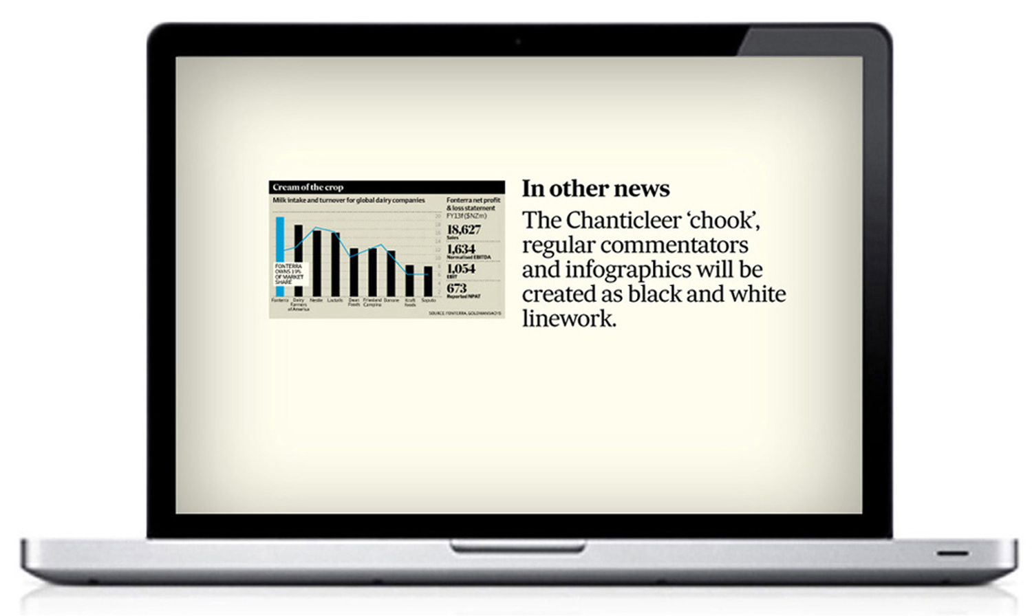
Colour was high on the agenda. It has been used strategically, and sparingly. The punchy AFR cyan has been paired with a darker cyan. Classic and traditional, black and white is key to the new look. It is newsy and prints crisply, and when combined with a minimal colour pallete, adds to the discipline and authority. An artist was commissioned to draw the columnists as black and white illustrations, and infographics are predominately black and white in a further nod to the Financial Review of old.
An in-house team was involved at every stage, and with careful articulation and direction to the broader team along with regular training sessions in the lead-up to launch, the new look was embraced with very little resistance. The new weekend masthead drew lots of breaths in-house, but launched with a minimum of fuss.
AFR Editor-in-Chief Michael Stutchbury RECOMMENDS SOO
____________
BACK to projects...
____________
NEXT project...
____________
SEE MORE REDESIGNS in the gallery...
